Europe's oldest community foundation reframes its core identity

After an incredible 50 years of grant-making and community leadership, the UK and Europe's oldest community foundation, Wiltshire & Swindon Community Foundation, had outgrown its brand. The numbers told the story: they'd grown from distributing under £1 million annually to over £2 million in just a few years, yet their brand wasn't reflecting this transformation.
Their impact, partnerships and programmes had accelerated, but their identity no longer reflected who they were, what they did, or the breadth of people they served.
The foundation needed to
• reinstate Swindon in its name,
• move beyond a white horse logo that excluded much of the county, and
• clearly express what made it distinct within a network of 47 community foundations
in order to set new foundations for future growth and impact.
Their work spans inspiring philanthropy, funding local groups, convening partners and supporting capacity building, but this complexity was hard to explain simply to everyone from major donors to local fundraisers and young bursary applicants.
Wiltshire & Swindon Community Foundation needed their brand to reflect their professionalism, work across all audiences and touchpoints, and look forward, all while celebrating 50 years of impact.
What Upshot Did
Creative strategy
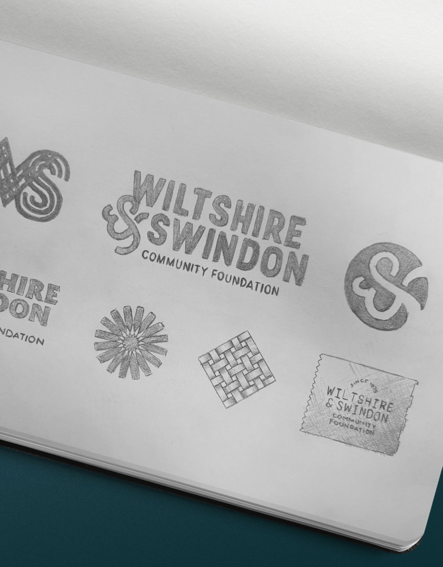
The brand work followed on from the foundation’s newly written five year strategy. Working with this we began by hosting workshops and stakeholder conversations to uncover more human-like or emotional characteristics we could build on.
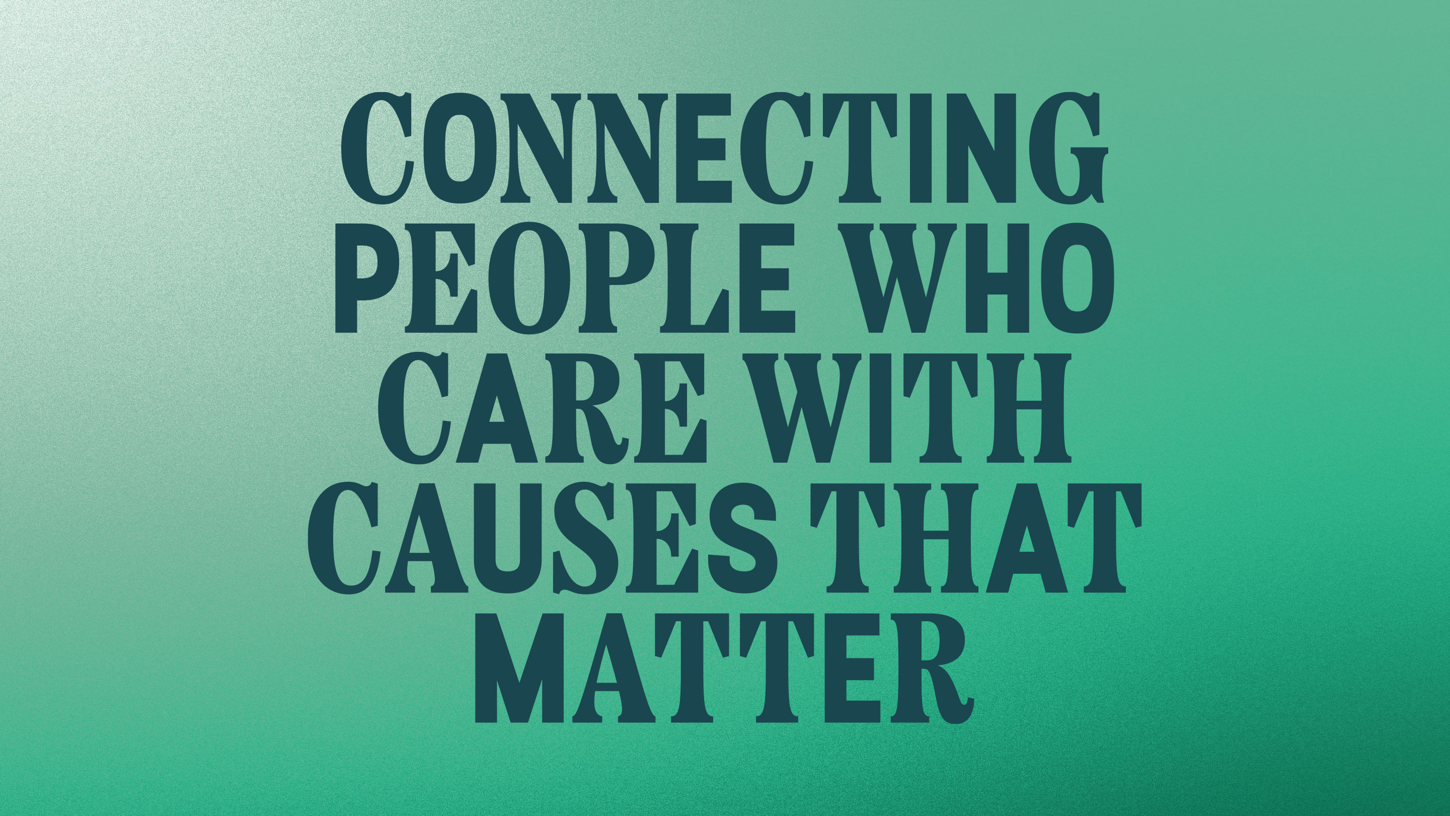
The long-standing line “connecting people who care with causes that matter” had become background noise, but when everything else was stripped away it revealed the heart of their role: they are connectors.
The foundation links donors with grassroots groups, public bodies with community organisations, and individuals with opportunities.
Recognising connection as their superpower gave the team a powerful, simple way to describe their value and reframe themselves not as the hero of the story, but as the enabler of others’ success.
Visual concept
The connector idea became the backbone of the identity.
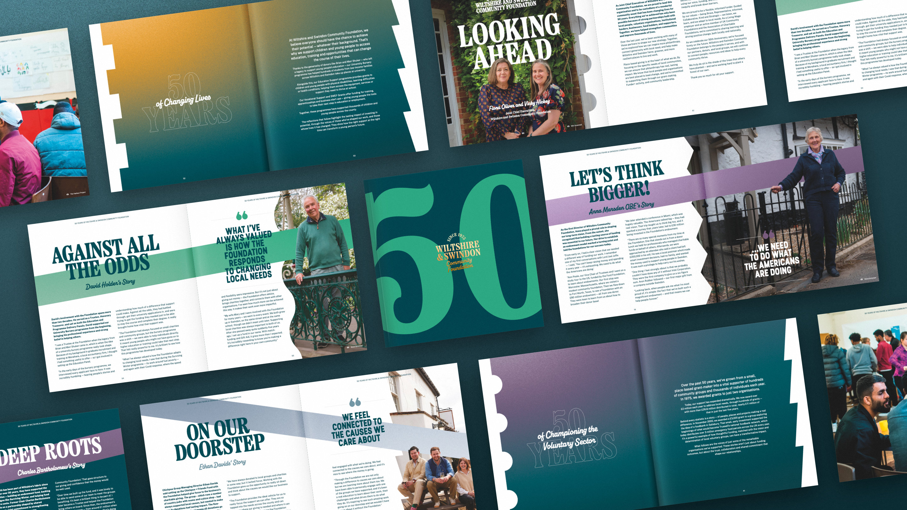
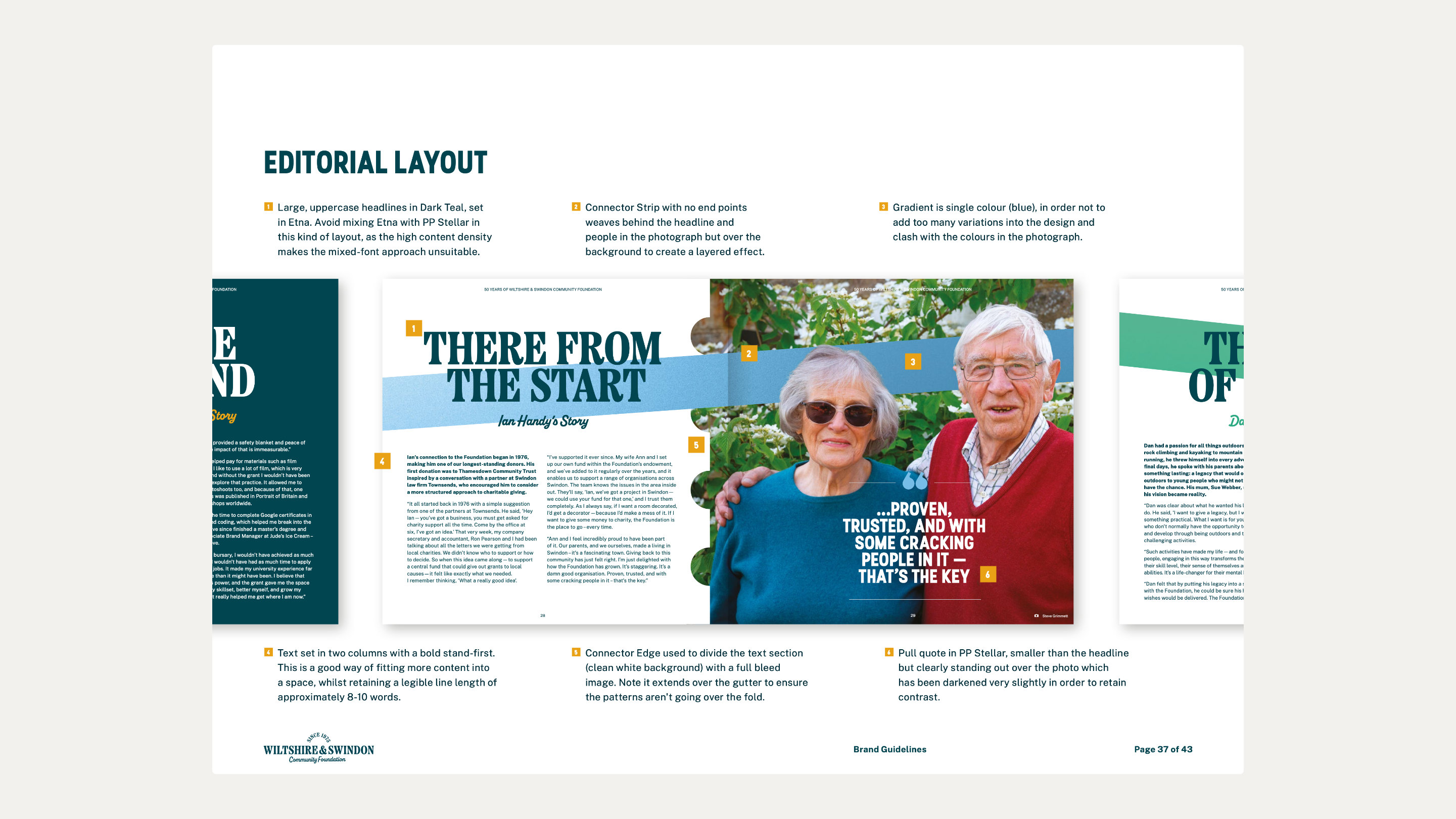
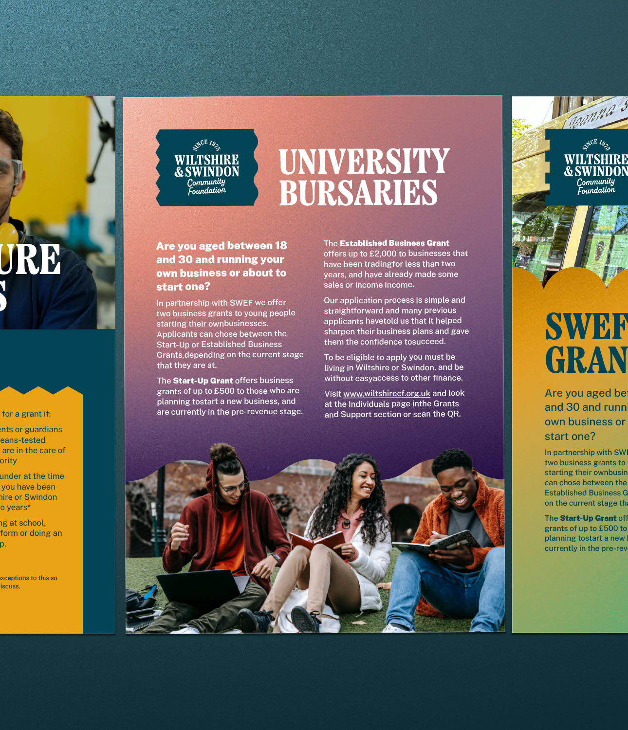
A new logo system uses a frame of connector shapes – edges that only fit together with the right adaptor – symbolising the way the foundation brings different people, places and needs together. Multiple connector edge patterns represent different types of relationships and can be mixed and matched, mirroring the flexible, inclusive nature of their work.
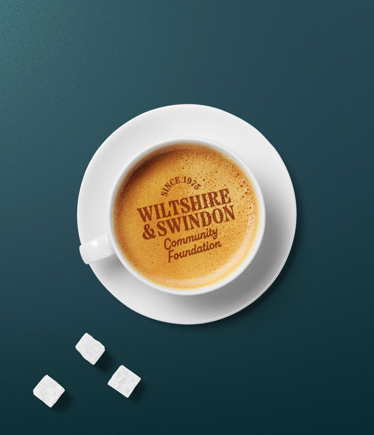
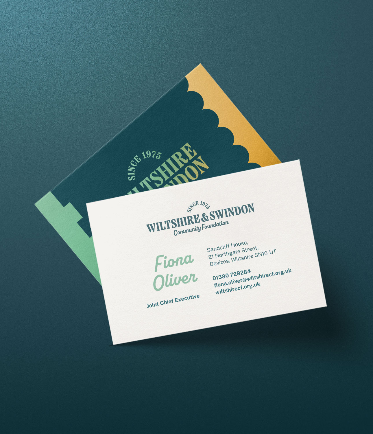
A typographic system balances authority and warmth, with transparent lettering that reveals blended colours behind it to express the bringing together of different elements into something stronger than the sum of its parts.
"We're the same organisation we were when we started this process,” says Beth. We just hadn't uncovered that bit of magic about ourselves. Upshot helped to uncover that incredible thing about us that's authentically special. It was there all along. We just couldn't see it.”
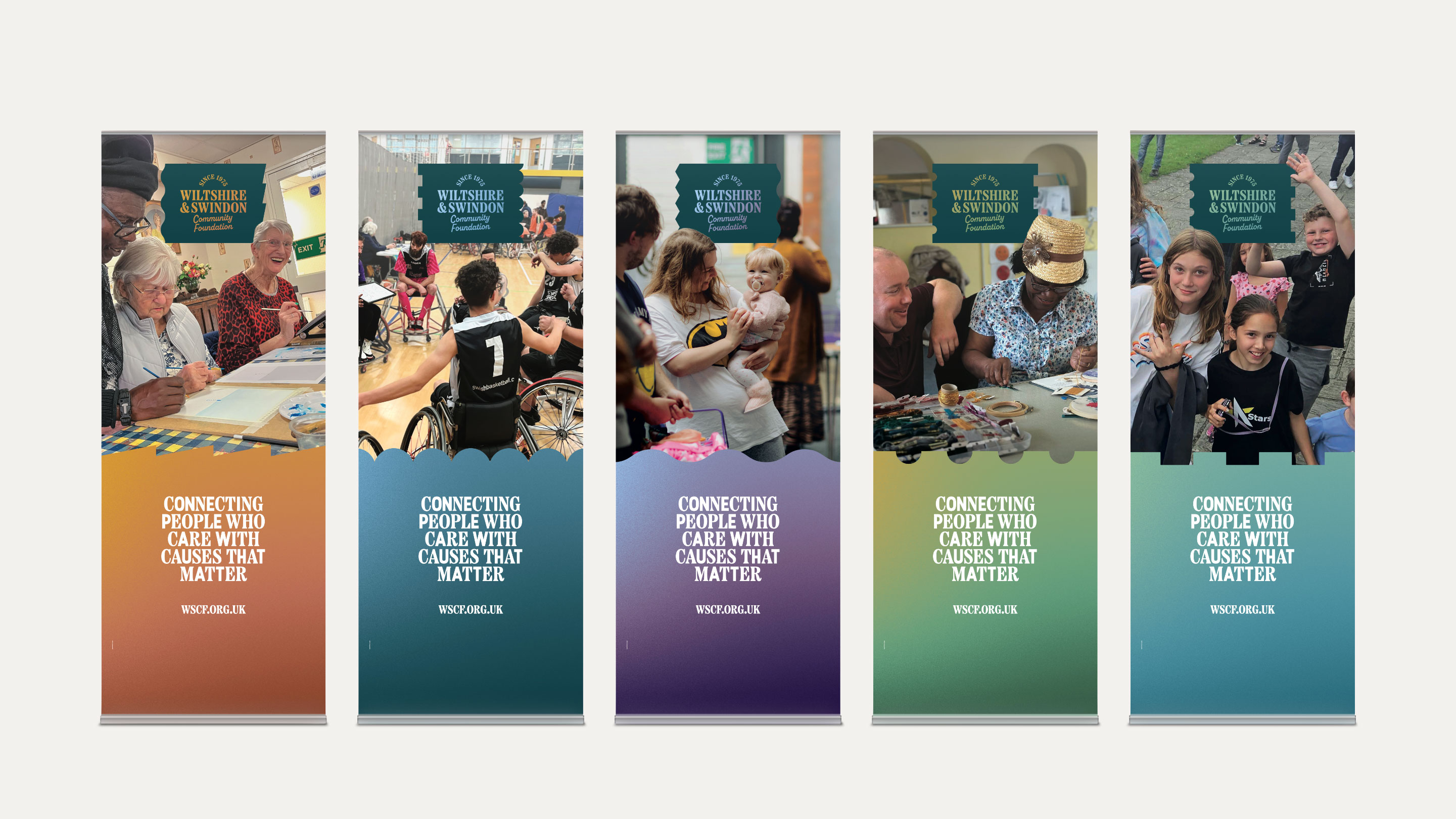
Identity system
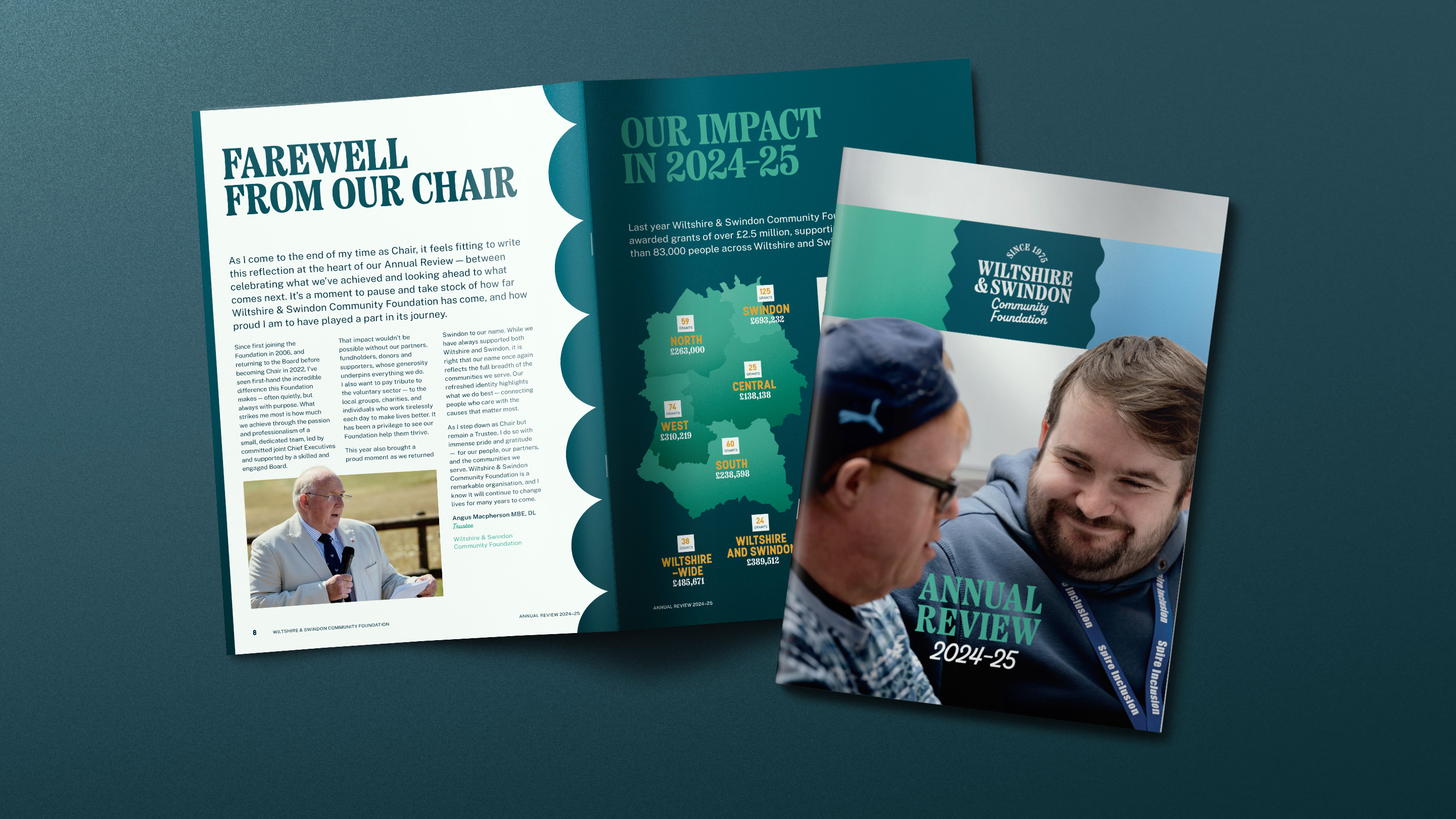
A full visual system was developed to work from flagship pieces to everyday Canva documents. This included a primary and supporting colour palette inspired by local places, grainy gradients to add warmth and authenticity, connector strips and frames as repeatable design devices, and clear type hierarchy with practical guidance for the internal team.
The system was intentionally designed to help the communications team create consistent, professional materials quickly, whether they were producing banners, funding reports, job packs, or social graphics.

The Impact
Early reactions from stakeholders have been strongly positive. Readers of key publications now say they better understand the breadth and depth of the foundation’s work, community groups feel more clearly represented in how their stories are told, and donors can more easily see the wider impact of their giving through the foundation.
The brand now positions Wiltshire & Swindon Community Foundation strongly for the future, supporting clearer positioning, better engagement and a confident platform for the next 50 years of connecting people who care with causes that matter.
Specific results include:
- Stronger positioning: The foundation can now clearly articulate what makes them unique as a connector in their community
- Enhanced internal confidence: Staff across the organisation feel empowered to talk about their work with pride
- Better engagement: Stakeholders report better understanding of the foundation's breadth of work
- Practical efficiency: Day-to-day materials are easier and faster to create while maintaining quality
- Future-ready unity: The brand positions them strongly for continued growth and their next 50 years
"I feel totally reinvigorated," Beth says. "I think it's given all of us a common way of thinking. It's given us huge confidence in being able to really talk about ourselves."
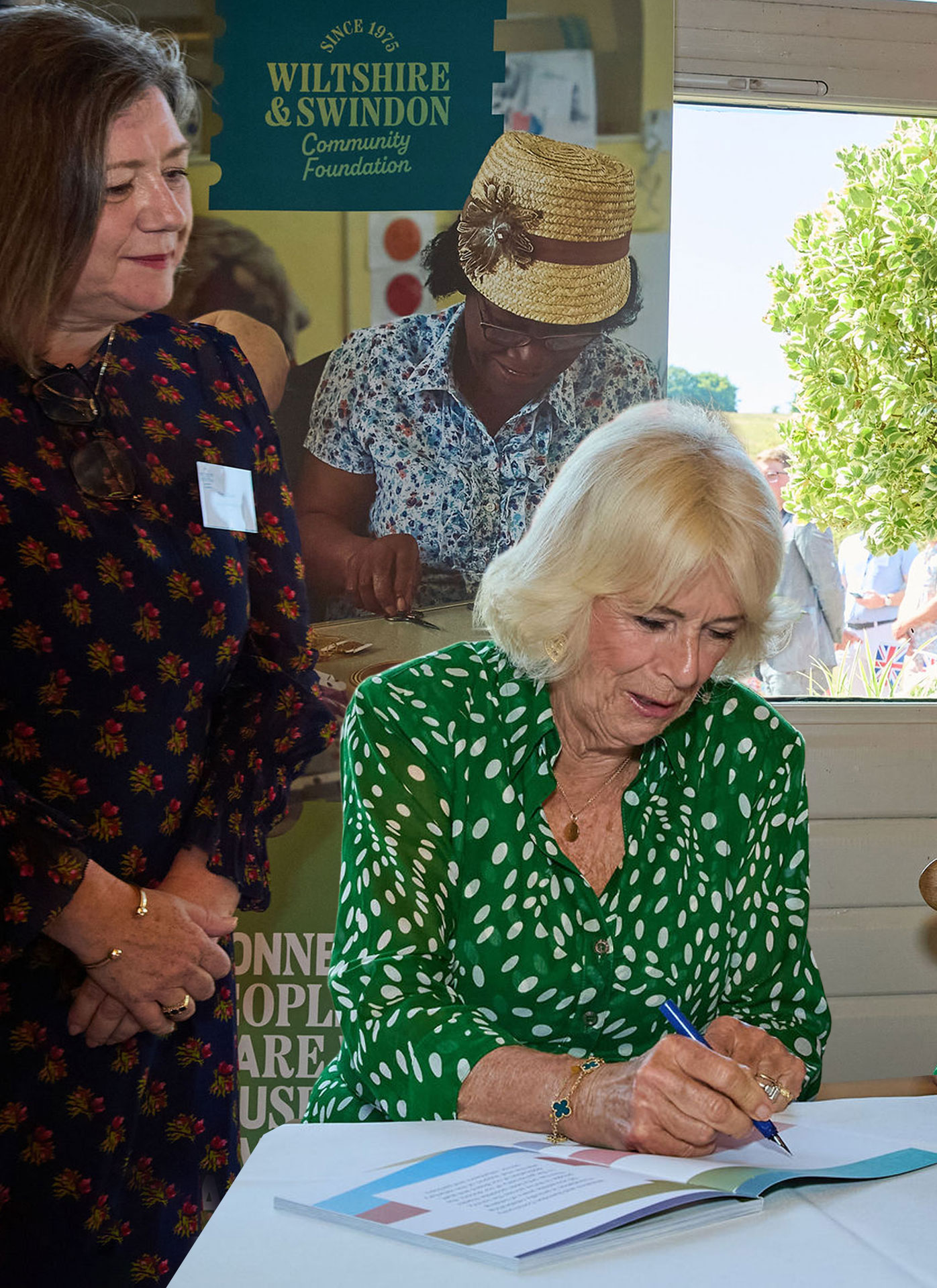
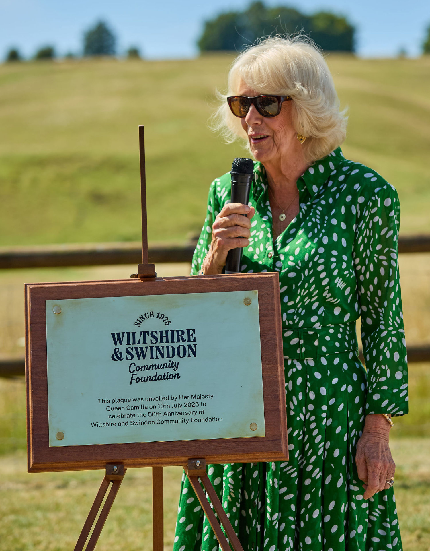
The new brand made its public debut at the foundation's 50th anniversary celebration in July 2025, where Queen Camilla – a self-described 'Wiltshire girl' – unveiled the anniversary plaque showcasing the new identity. It was a fitting moment: a rebrand that had given the team confidence in who they are, launched at an event celebrating five decades of connecting people who care with causes that matter.

"The connector idea was an absolute stroke of genius. It feels so obvious now, but it wasn't obvious to us before. This process uncovered our essence – and once we realised connection is our heart, our core, everything else fell into place. The cleverness is the simplicity."

What this means for similar organisations
Wiltshire & Swindon Community Foundation's transformation reveals a truth many mission-driven organisations face: when you're busy delivering impact, your brand can easily fall behind the reality of your work.
The result isn't just aesthetic – it's a confidence problem that permeates everything.
• Staff struggle to articulate what makes you different.
• Donors can't fully grasp your impact.
• Every communication requires reinvention.
As Beth discovered, "We just didn't know ourselves with the old brand. What we had was simply a logo, nothing that told our story or expressed the real difference we
make.”
But when you finally uncover that clarity – your "connector" moment – everything shifts. The team finds confidence. Stakeholders understand your value. And critically, you stop wasting resources recreating materials from scratch.
For charities where every pound must work harder, brand clarity isn't vanity – it's the foundation for sustainable growth and the confidence to show the world the organisation you've already become and what you're on the way towards.