PLP faced challenges from new competition. We helped them reinforce their experience and expertise through their brand.

Plymouth Learning Partnership (PLP) is a community interest company with a range of teams sitting within it including a recruitment agency, supply teaching agency and a large team providing services to vulnerable children & families.
In their own words, the website was ‘tired, out of date, and seemingly rarely accessed’. It was clear that the brand did not reflect the quality of the standard of services offered – and tackling this would be essential to reaffirm their position and create a meaningful and joined-up online experience for the schools they serve.
What Upshot did
Strategic thinking
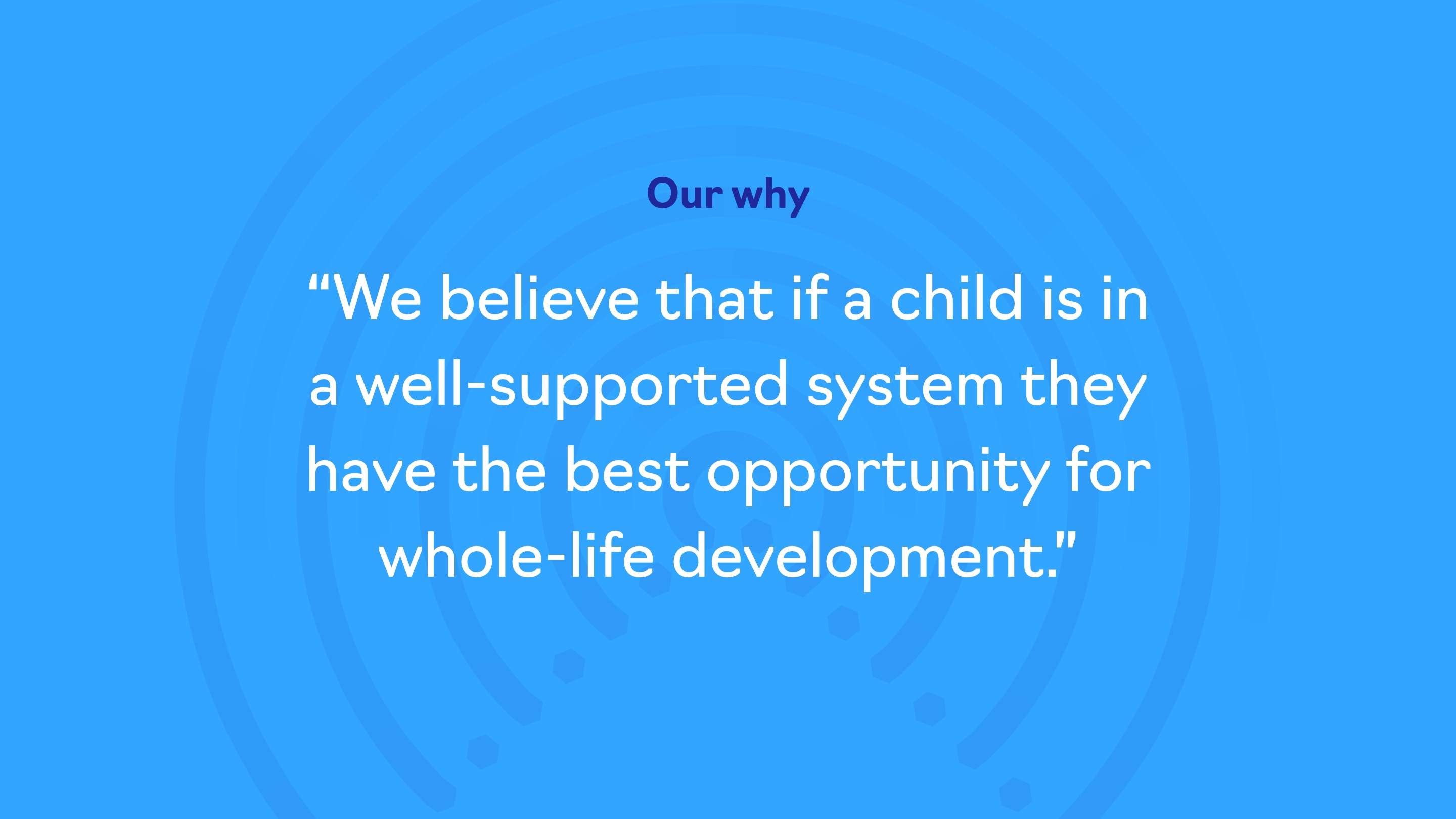
PLP has been in operation for many years, and has led the way in what they do for most of that time. They knew that their level of service was outstanding. But the nature of their work and status had meant that they lived life at 100mph – putting out fires (metaphorically), intervening in critical incidents and investing in other people. A long hard look at their own purpose and mission was overdue.
With multiple sub-brands operating under the PLP banner, brand strategy would require us to find common ground and purpose across the group. We worked with the senior team including CEO, Lisa Hartley, her team leaders and their educational psychologists to draw out a clear sense of purpose that would help build a foundation for their brand identity.
It was important to retain brand equity and not lose too many elements that schools recognised – evolution not revolution was the aim.


Visual identity
The PLP group has always been associated with a hexagon, and although the logos themselves had become tired and haphazard, an element of consistency held them together. Playing on their values, we wanted to introduce a sense of movement and responsiveness. Imagining a human at the centre, PLP surrounds and supports them in various ways, and the logo represents this.
Hexagons became bigger, bolder and brighter, with distinctive colour palettes developed for each sub brand, and neat typographic hierarchy designed to give clarity. A common reason for brands’ decline in consistency is often a lack of clear guidance and inspiration – something we made sure to build into their rebrand through a manageable brand guidelines document and ongoing support. Their service brochure was redesigned to be made clearer to navigate, and various other administrative and marketing materials were printed, ready to go.
Website design
From multiple websites into one – each company (PLP, Multi-Agency Support Team, Supply Plus, Schools’ Post, and Property and Compliance) previously had a separate site. This meant search engines weren’t necessarily going to pick up on their unified presence, and links between the sites were less natural.
The breadth and dynamism of PLP’s services are now clearer, with a more noticeably unified approach. Functionality and legibility are much improved, and the group’s long-established presence is better represented.
View the new PLP website here.

"Our brand should reflect how clients speak about us, and Upshot really understood this. Besides delivering an amazing new website, Upshot's true value was clarifying our values and organising principles. Now, our outward appearance matches our high level of service."


Impact
The new website and visual identity have given Lisa and her team of stalwarts succinct and well-articulated language to describe their organisation – both verbally and visually. We were initially asked to help create an eye-catching upgrade, but went beyond that to deeply instil a sense of pride in the team. A more up-to-date website was the aim, but they now also have a far more functional online presence that gives audiences ways to book into training and CPD, sign up as a member, and find out key information. This all adds weight to the group’s reputation.


