After ten years building websites for clients, Elixel realised they'd never properly designed their own.

Elixel had spent ten years designing websites for clients. They understood narrative, user experience, meaningful interaction. They'd built a respected agency with international team members and a strong reputation.
But there was a problem: they weren't positioned the way they needed to be.
"When you build the site yourself," Gavin (CEO and founder) reflected, "you're talking the way you want to talk, not necessarily the way people want to hear you." Their old brand was technical, focused on pixels and precision. Their communication used industry language that made sense internally but didn't resonate with the high-end businesses they wanted to attract.
Most critically: they lacked the bandwidth and external perspective to fix it. "Although we've spent years building websites for clients, doing it ourselves would have taken us ages amongst other work. We wanted to get an external view of the business – how do other people actually see us?"
What Upshot did
Through collaborative strategy work, they helped Elixel articulate what was really true about them: they created meaningful human interactions. Not pixels. Not code. Interactions.
This wasn't abstract. It was commercial. It was a way to position themselves differently in the market – not as technical experts, but as human-centred designers. It was a way to speak to the clients they actually wanted to work with.
The Visual Identity
With that clarity, the design direction became purposeful and inevitable.
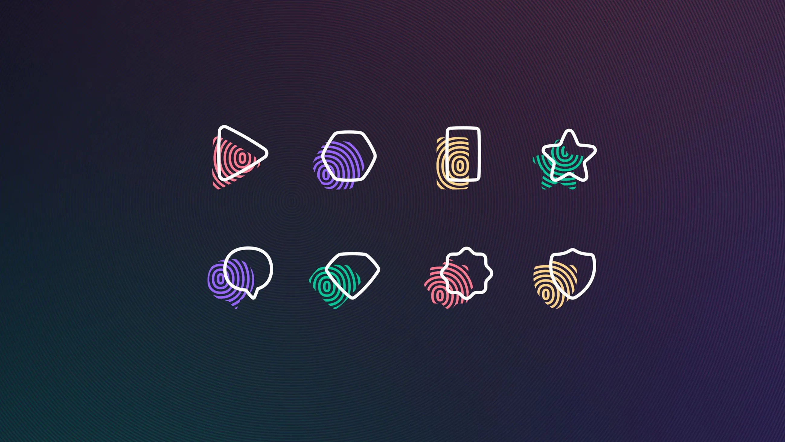
The new fingerprint motif emerged directly from the strategy. Not security, cleaning products or forensics, but human uniqueness. Every interaction Elixel creates is uniquely tailored.
From there, every design decision reinforced this positioning:
Micro animations brought life instead of static precision. Custom illustrations conveyed warmth and approachability. Softer shapes replaced hard pixels. Typeface choices communicated personality.
This wasn't design for its own sake. It was positioning. It was the visual translation of "we've moved from pixels to people."
"All the visual ideas were direct results of the strategy work," the founder said. "Brand strategy, identity, and web design were interwoven together."


Visual identity
Moving away from a harsh square-based design-system, a more human feel was required. The fingerprint was the ultimate symbol to represent meaningful interactions – refined and styled in a way that felt personal enough not to suggest security or passwords, but graphic enough not to imply police records or antibacterial cleaners…
The rings or waves that emanated from this implied screen ‘tap’ gave us a playful visual language that wove its way through icons, illustrations, backgrounds and headlines. Colours and type choices gave a rich and personal mood to the identity and built a matured version of their previous look and feel.
Website design
Bringing the concept into their new website helped us create a sitemap and user journey that supported their goals, and a distinctive look and feel that significantly improved the impression they were giving the world compared to their previous site.
From case studies written by their clients, to helping them break down their services and processes more helpfully, the content was created purposefully and meticulously to reinforce their big idea.
Check out the Elixel website here.

“Having this new brand update and the new website and being able to tell our story in a meaningful way has really set the foundation and the benchmark for us as a business.”


Impact
Had Elixel simply carried on and redesigned their website, even following all the recognised and proven UX rules, they would have simply remained another agency that talked about their work and themselves like everyone else. Bringing Upshot in with our external perspective helped them do things differently.
With the benefit of knowing what they wanted to be known for, their website was designed specifically to highlight why they would be a great match for their visitors – providing functionality and language cues that communicated more distinctively, and with the added confidence that they knew it represented them, and nobody else.
Their full visual identity was designed around the idea of creating meaningful interactions and this purpose statement, alongside their values, clearly differentiated them from their competitors. Far from being a dry or manufactured series of words, these values can be lived out through their interactions with staff, suppliers and customers and are ingrained within the look and feel we created.


