First Give needed a clearer proposition to build on their great impact in schools across the UK.

Since 2015, First Give has worked within schools in London and around England and Wales, delivering a comprehensive programme encouraging young people to recognise social issues in their communities and taking action to address them.
Researching, reaching out to experts, building teamwork skills, and presentation skills are all taught and guided, and each school hosts their own School Final at the end of the year, allowing their students to put their learning into action and win their chosen charity a grant of £1,000. With a small internal team, plus a board of trustees and various facilitators, First Give is a small charity. But at the time of writing, they work in over 200 schools UK-wide each year, impacting thousands of children and helping them to make a difference where they live.
What Upshot did
Strategic thinking
As it quite often is, the pain point that drove First Give to rebrand was to do with a need for consistent, low maintenance and impactful graphics and materials.
However, as we dug deeper into the root of the problem, it became clear that their issue was a lack of identity: they didn’t truly know what they wanted to be known for. They had grown organically and needed help taking the next steps towards building a strong brand that would strengthen their operations moving forwards.
The big brand idea came from investigating their sense of purpose, which we summed up through the statement “Empowering young people; igniting a spark of social conscience.” Five core values helped form pillars that would hold up the brand and directly influence how the charity would make decisions and communicate. By itself, each word could feel fairly ordinary, but with context (and the other pillars to support them), they create a specific and holistic picture of First Give.


Visual identity
The old logo read as 'G1',and there was no system for consistent colour and typography. Once we knew exactly what made them unique we underwent a collaborative ideation process, eventually landing on the perfect solution – a logo that showed an abstract F mark featuring a subtle spark shape in the negative space and tying in perfectly with their purpose statement.
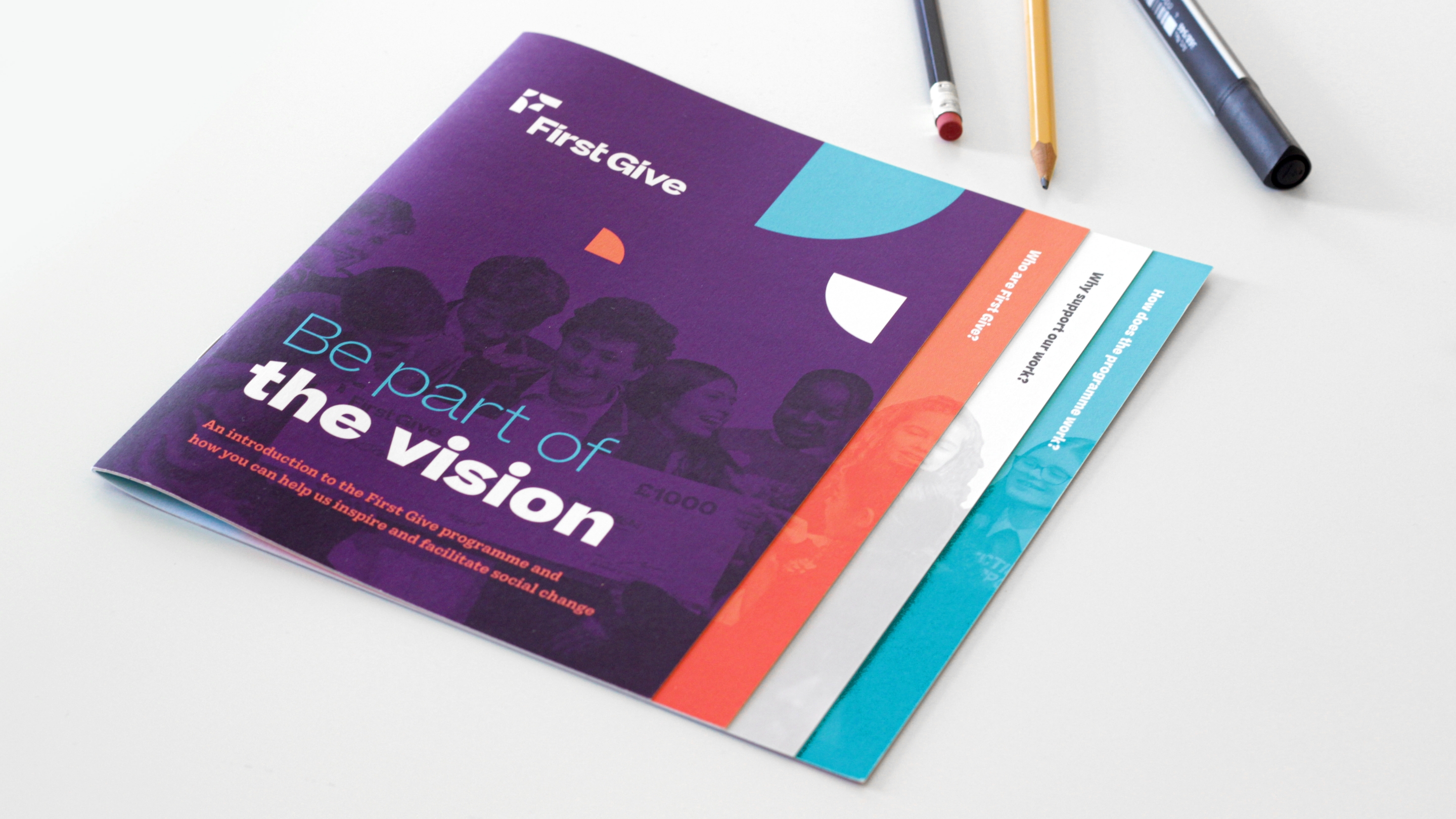
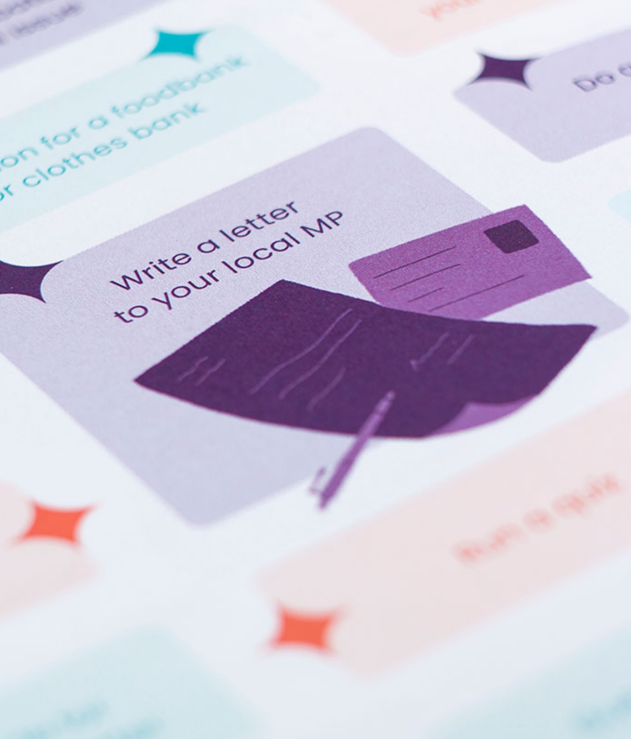
The logo gave us masses of potential to develop a clear visual language and the identity was rolled out across a huge range of literature, merchandising and publicity pieces. We collaborated with a fabulous illustrator called Aditi Kakade Beaufrand to produce bespoke imagery that complemented the colour palette and photography style, and developed a robust set of brand guidelines to help them keep the brand consistent going forward – a major requirement of the initial brief.
Website design
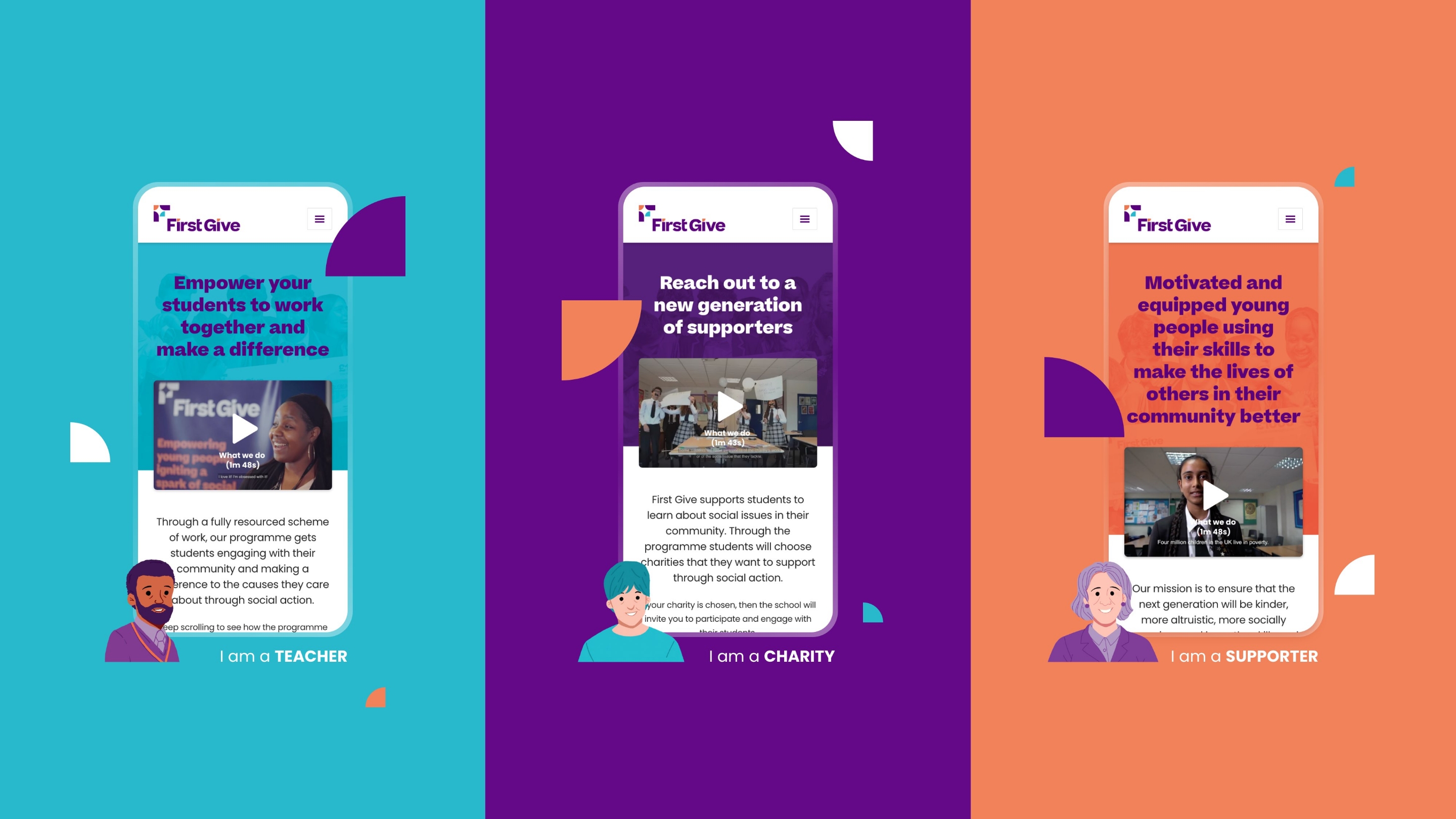
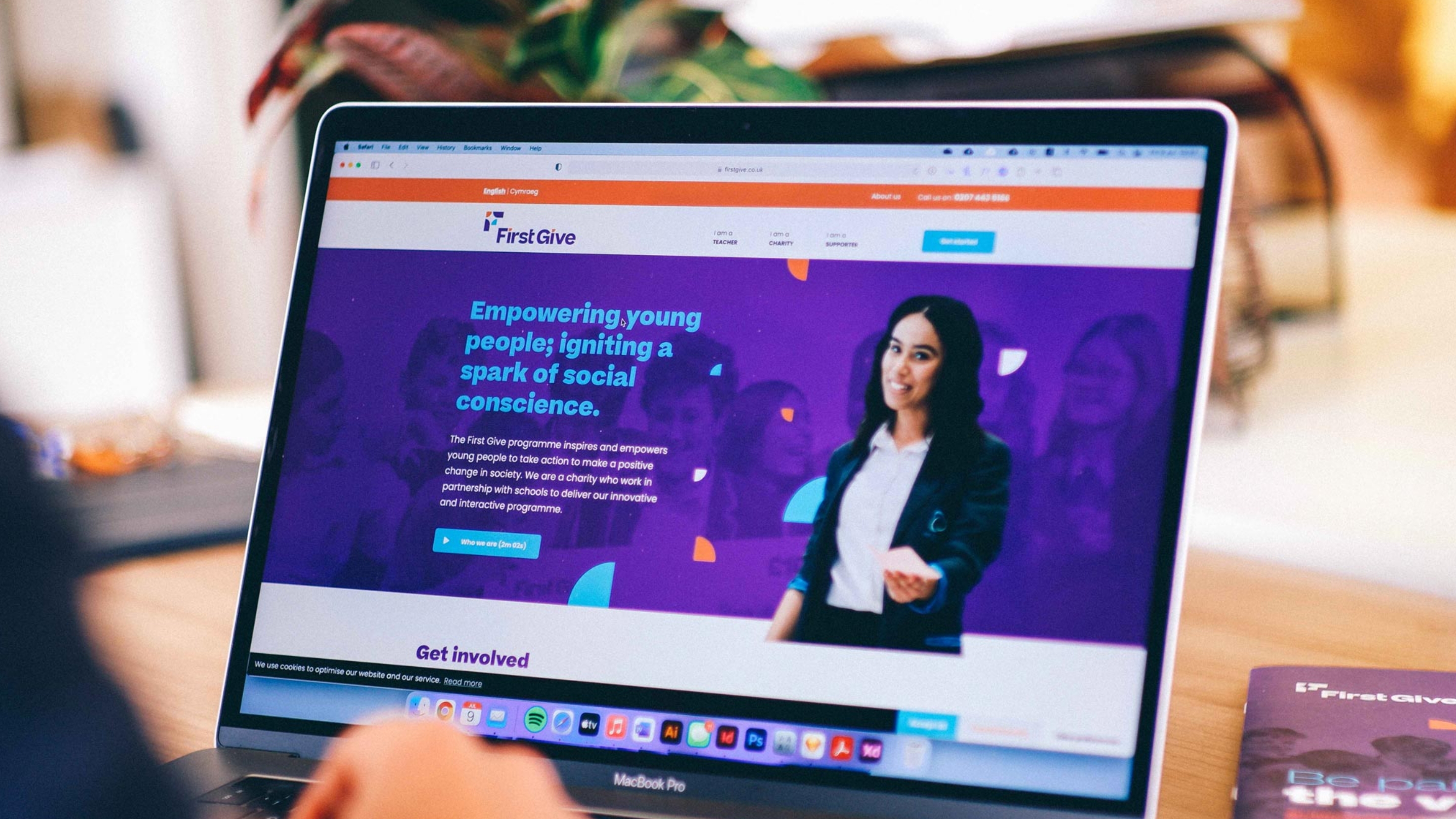
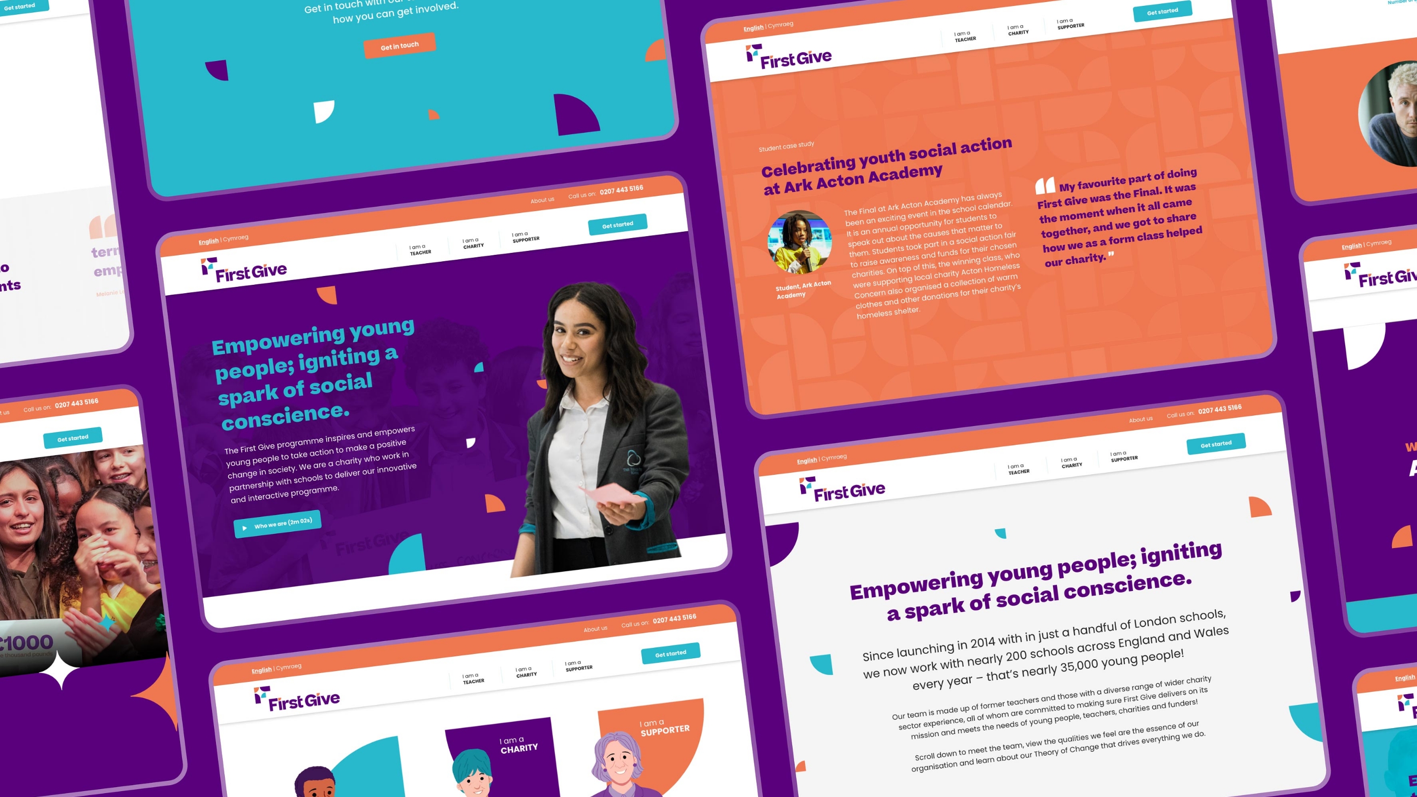
First Give’s existing site was causing difficulties. Messaging was inconsistent and didn’t reflect any real user journey, meaning nobody actually ended up with the information they required. Having worked with us on their rebrand and subsequent projects, they turned to us to help create a deeper and more targeted site that communicated much more clearly the value of their offering and improved user experience.
Working closely with the client as well as Wordpress developers, Elixel, we wove First Give’s values and purpose through the site, creating parallax-style animations, illustrations, copywriting and bold brand design to communicate the right messages and hold people’s attention.
View the First Give website here.

“The new look and feel of the charity is exactly what we wanted and needed. All of the schools we work with tell us how good they think the materials look! But what’s been particularly great is that internally the brand strategy has allowed us to focus more on why and how we do what we do.”


Impact
The real test came just a year on, when the COVID-19 pandemic hit the world.
As an organisation with their single offering being delivered in-person within schools, lockdown meant they had no means of operating. Schools couldn’t run the programme.
But with a clear brand strategy in place, First Give knew what it stood for as a brand. The team knew what they wanted to achieve (to empower young people; igniting a spark of social action), and they knew what characteristics or values defined their organisation. Therefore they could find new ways to achieve their purpose in a consistent way, and not lose sight of their mission. Their ‘First Give Helping from Home’ initiative brought their social action challenge to a much wider national audience than they could have managed in-person, inspiring young people and empowering them to make a difference in their communities.
Where they could easily have been thrown into disarray, knowing their values and what they wanted to be known for saved them from collapse and enabled them to continue operating and working towards their mission. The ‘what’ changed. The ‘why’ didn’t. Their programme has since gone from strength to strength and runs in more and more schools every year.
Moving forward, the charity has taken great strides in introducing new pilot programmes and diversifying the way they deliver on their mission. They run their core programme in over 200 schools across the country (previously they had only been able to operate in specific regions), and their team and board has expanded and set its sights on even bigger and better things.


