The Simplicity Illusion – The Sequel
27th May 2020
Keep It Simple, Stupid. What marvellously strange advice!
Is simplicity really all it’s cracked up to be? Does it have to be so highly revered and prioritised? Is it really the key to good communication? I guess it depends what you mean by simple.
Communication involves the transmission and understanding of a message. It’s easy to see why simplicity has become such a common and desirable trait to achieve this, but do we even mean simple when we say it? And if so, what do we mean by it?
What is simplicity?
According to the Oxford dictionary, simple can mean ‘easily understood’, but perhaps a better word for this attribute is clarity. If it isn’t clear, it won’t be easily understood.
There is a tendency to veer towards some kind of holy grail of simplicity in all kinds of situations in our industry, particularly within aesthetics. In reality, when people talk about simplicity in design they often mean minimalist – stripped right back to the bare bones without flourishes or superfluous extras. Fine, when appropriate, but not a universal approach.
I hear the word used by students and young designers to describe their work – “I create simple design solutions” or “I’m influenced by simple design”. Ok great – did you work hard to understand all that you were boiling down into that solution like a chef removing the imperfections from their consommé, or is it simple because it’s weak and superficial? Are you only influenced by design that has simplistic form, rather than design that is perfectly executed and solves the problem in hand?
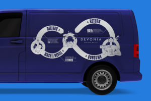
Similarly, I hear it used to describe how a client might want their logo, even if that’s not necessarily appropriate or even what they really mean (see my prequel to this article, written five years ago) – almost as if making it simple might diminish the amount of work their designer will need to do and reduce the fee (or result in the next Nike tick).
Well refined minimalism takes a lot of hard work to deliver brilliantly, and without that depth of thought and graft, it often results in something that just comes across as naïve and poorly crafted. The same problem extends beyond design aesthetics into messaging, and this is, perhaps, where it has the potential to become more dangerous.
When simplicity backfires
We have seen ‘simplicity’ at work in possibly its most misleading and dangerous way this month.
Whatever you think of the way the UK Government has dealt with the Covid-19 situation, you’ll probably admit that their initial slogan when lockdown was introduced was fairly unambiguous and clear.
STAY HOME. PROTECT THE NHS. SAVE LIVES.
So we stayed home. And this protected the NHS from overcrowding. And, one assumes, this saved lives.
As lockdown restrictions were eased, however, somebody somewhere decided that the strap line should change too.
STAY ALERT. CONTROL THE VIRUS. SAVE LIVES
What?
STAY ALERT. CONTROL THE VIRUS. SAVE LIVES
Oh, yes, that’s what we thought you said…
It sounds like an afterthought – thrown out nonchalantly with the only real ‘brief’ being “make it sound simple, a bit like the old one”.
The fact is, the wording is wrong.
The practicality of informing an entire population of what to do in such difficult circumstances is complex. Why make it ambiguous too? It seems the wording is trying to say too much, as this article on New Statesman explains. But on face value, we’re being told that we can control the virus by being alert. If there’s a way to control the virus by being ‘alert’ it probably needs explaining. And if it needs explaining, it probably wasn’t the right choice of words.
Fallout
Commentators, press and public all joined in to express confusion, concern or, in some places comedic light relief; revealing the extent of the farce that the slogan had become. Scotland, Wales and Northern Ireland rejected and distanced themselves from the advice and opposition politicians rallied against it, publicly questioning what the Government had meant to say. The fact is, the wording is wrong. A poll revealed that over two thirds of the public don’t understand what it means, and those who claim they do seem to vary in their understandings!
It seems to me that simplicity was prioritised over clarity, leaving the door wide open to interpretation, and some potentially significant personal, social, economic and political consequences.
When we strive for ‘simple’ above other, more critical qualities – whether in government advice or a logo design – we can easily find we reduce clarity. Sometimes better words are what are needed and sometimes, even, a few extra.
Simplicity often isn’t enough. Yes, make it succinct, memorable and uncluttered. Take a minimalist approach if you must.
But for goodness sake, make sure it’s clear.