The Simplicity Illusion (2015)
13th May 2020
This is an article I wrote in April 2015. I’d experienced a situation that got me thinking about the perils of leaning on simplicity and, having revisited the subject for a new article to be published this week, I thought it’d be worth moving the old article over to the Upshot journal for ease.
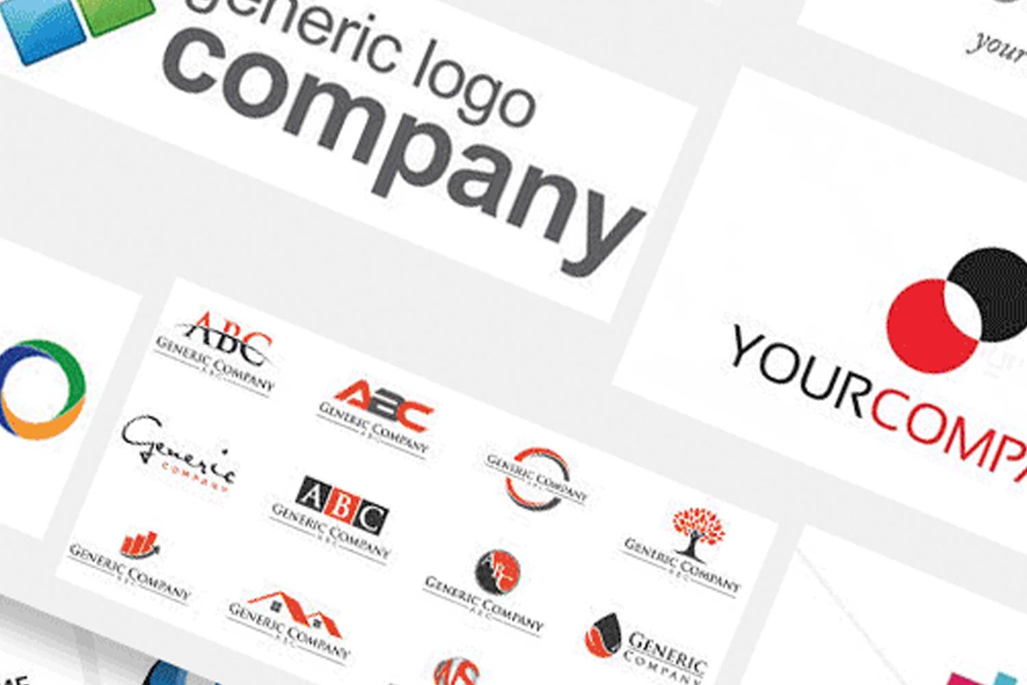
“I don’t want anything too clever – our logo is simple and that’s what we want.”
Simple. That word, eh? The designer scratches his head and gropes frantically for the balanced and tactful way to respond.
“Actually, your logo looks… well…”. Words are failing him and he’s in too deep.
“Looks… well… what? Come on – you can tell me.”
“Honestly?” That terrifying moment of realisation that he’s about to say something he’ll regret. “Honestly? It looks a little bit, well, a bit childish.”
Ok, stop now. Stop, don’t carry on. Uh, oh. Too late.
“It’s unoriginal and poorly crafted. It makes your company look like you don’t care about your appearance and that implies that you might be unprofessional or untrustworthy.”
Silence. Really uncomfortable silence.
Wow. He said it. In all honesty, he’d actually held back a bit but he knows he’s said way too much. Maybe, just maybe, it didn’t come out as badly as he felt it did?
Maybe?
Oh dear.
It’s a fairly common conversation for designers, especially ones starting out. Good designers can usually find more helpful ways to offer critique but it’s understandable that it can be quite tricky. Designers love great design – of course. We see it every day, we’re inspired by it and we aspire to create it. Naturally it’s going to cause us some discomfort trying to discuss it with someone who doesn’t have that same passion or discernment. But to really communicate that feedback constructively we’ve got to get away from personal feelings a bit. It’s not just a subjective, personal-taste problem and we don’t have a monopoly on the knowledge of what looks nice.
But being simple doesn’t necessarily make it good.
What is simple?
Simplicity is great. When it’s in context, that is.
But what if that now ex potential client’s business were a high-end engineering company or a firm of high-calibre and very expensive solicitors. What if their business really wasn’t about ‘simplicity’. Even if a logo is well designed yet simple, it may well be missing the point and misrepresenting the company, confusing the viewer or making a statement that just isn’t appropriate.
The sad thing is, in most cases the ‘simple’ logo in question is actually not really simple at all. Or maybe it’s simple, but in the ‘Simple Simon’ sense – lacking nouse, refinement and sophistication.
It’s not just a subjective, personal-taste problem and we don’t have a monopoly on the knowledge of what looks nice.
It may have been designed by a friend, family member or, even, by the business owner, themselves. That’s probably the level of simplicity we’re talking about. There’s a certain element of personal attachment and that can be very tricky to negotiate diplomatically.
The role and responsibility of a designer
And while designers can, sadly, appear fairly insensitive at times – often coming across as arrogant, judgmental and even unkind – we really don’t mean to be. When you get past our ingrained desire for aesthetic ‘purity’, really we have your best interests at heart.
We have trained long and hard to spot potential. We’ve spent years practicing aligning creativity with strategy. A good designer should have had discussions with you about what your company is about and what you want to achieve. A good designer may well have started by asking exactly what it is about your existing logo that you like, or that makes it ‘simple’. A good designer will know the reasons why a logo should (or shouldn’t) look a particular way – even if sometimes they find it hard to articulate it (just a brief aside: why, oh why, is ‘articulate’ such a hard word to remember when you need it…?).
You see, it’s possible that a simple logo can be good.
And, really, any good logo is usually going to have a degree of simplicity for it to be effective.
But being simple doesn’t necessarily make it good.
Good should be what you should aim for. Appropriate, effective, memorable and good.
—
Written by Owen in April 2015. Originally published on owenjonesdesign.com