Process: The Millennial Money Masterplan
9th June 2021
The process of creating an impactful book cover is often an iterative one – the initial concept often points us in the right direction but it’s the refinement of each element over time that results in something well rounded and shelf/Amazon-ready. Here’s a how-to guide for our most recent book design.
Having worked with Summertime Publishing (more recently Springtime Publishing) since 2013 we’ve created quite a few book covers for their authors. Once we’ve read it and got our heads around the key themes and messages we can research how best to portray them on the jacket artwork.
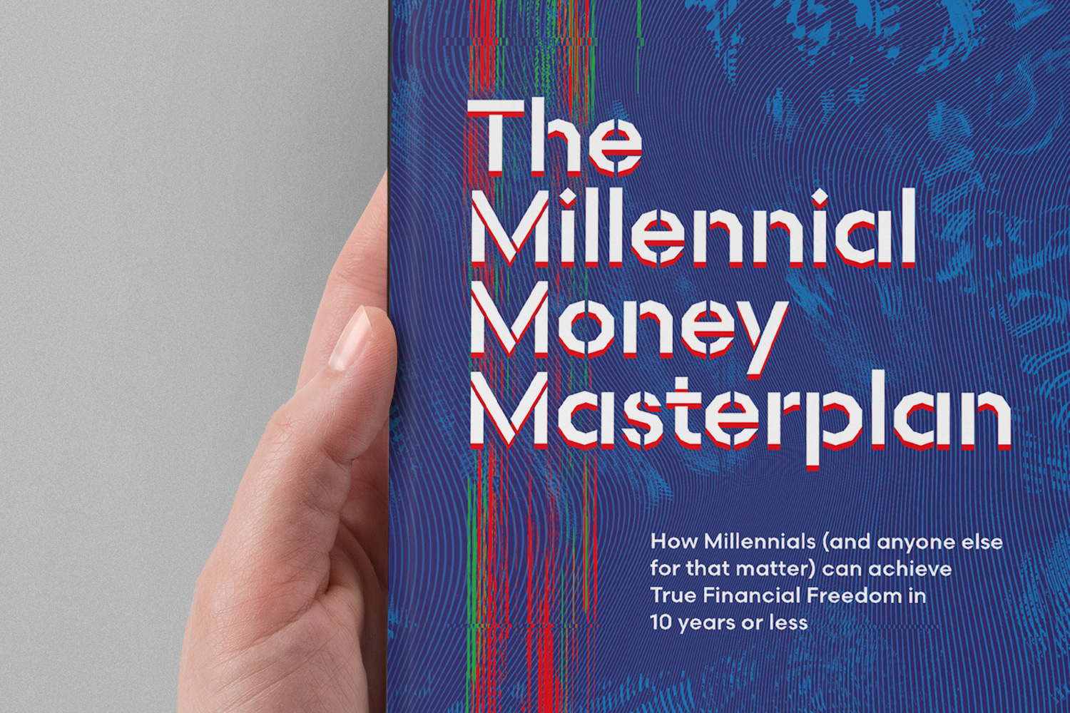
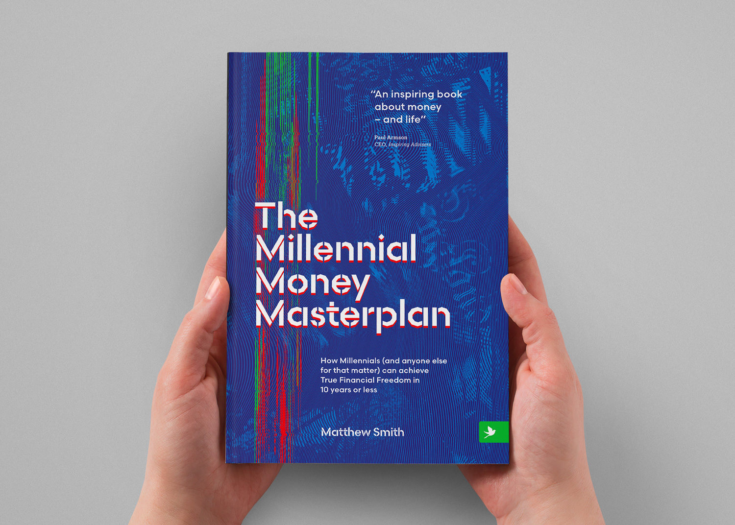
Our most recent Springtime book is The Millennial Money Masterplan by Matthew Smith. Matt is a financial advisor based in London with a dramatic story of a near-death experience and subsequent re-evaluation of his life plan. As a millennial he found himself frustrated at the media narrative that says his generation will never fully experience true financial freedom – so he fought back, and in his book he gives his advice to others in a similar situation to himself, providing hope and practical steps to follow.
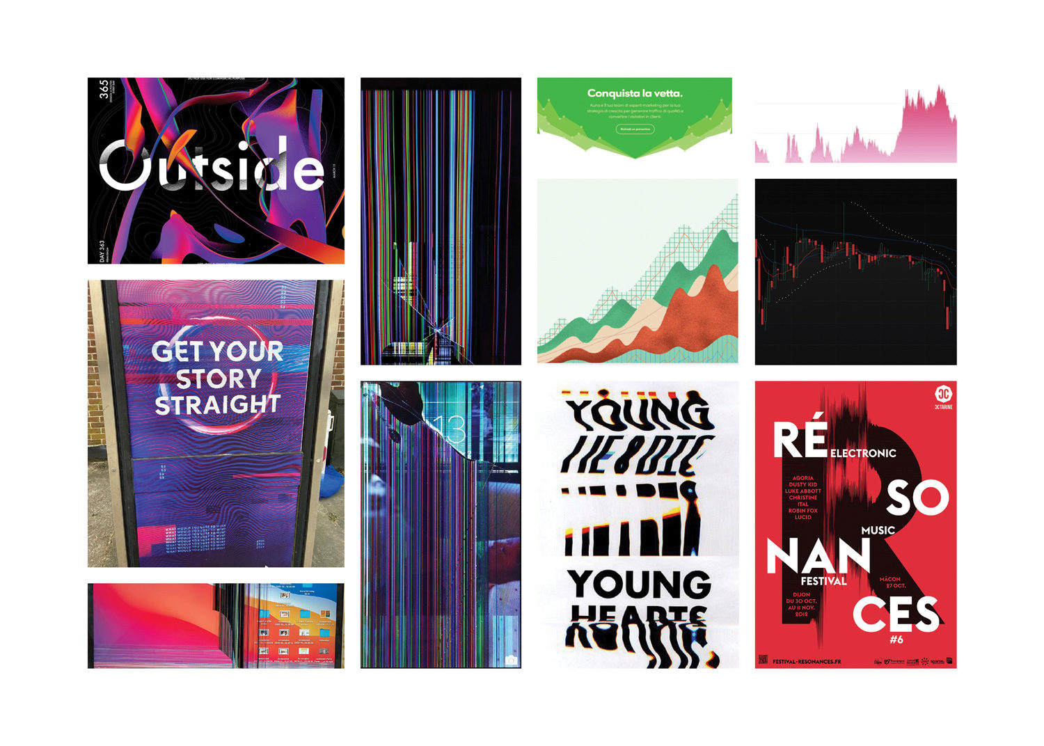
For this book we had a few initial inklings of ideas after the first read through. We created three mood boards, having narrowed down our routes. The chosen route took us down the road of a digital screen with images that implied that media narrative, but with a smash or glitch that showcased the digital generation breaking the cycle.
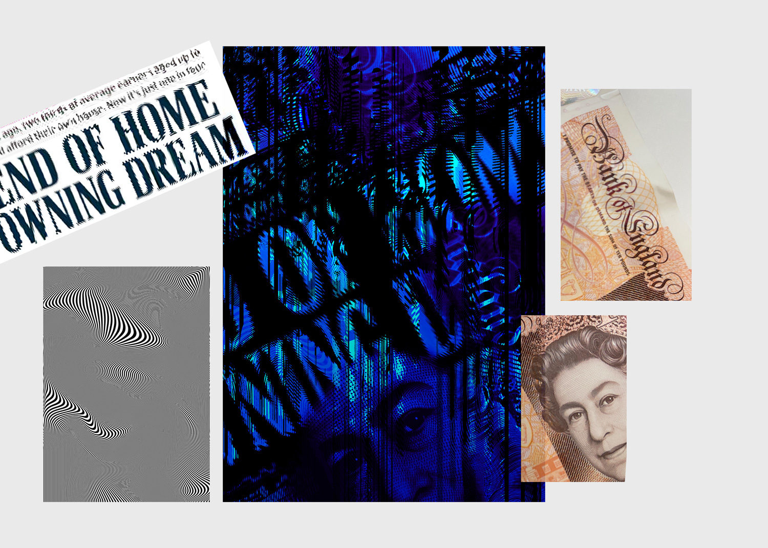
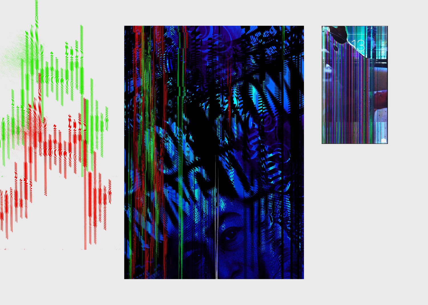
It occurred to us that the glitch (like the broken and stretched pixels that show up when a monitor or phone screen is damaged) could be made to mimic the red and green charts familiar to the stock market traders and symbolic of financial success and failure. Our first mockups felt really grungy and a bit too busy for a book cover (perhaps a bit too ‘Matrix’), but Matt loved the idea and encouraged us to dial it back a little!
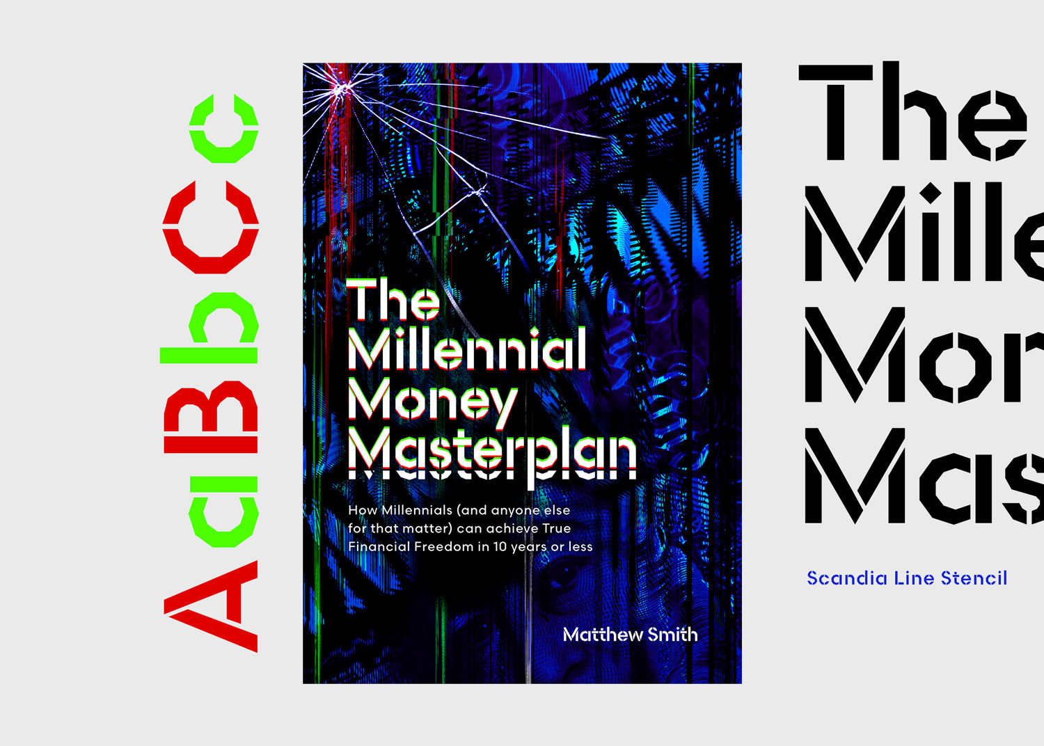
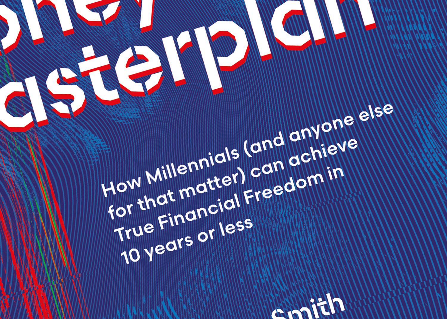
Typographically we wanted to find a font to represent the idea of rebellion and angst but with a digital edge. Protest graphics often utilise handmade stencil aesthetics, and we experimented with a number of typefaces with this style but nothing quite hit the spot until we discovered Scandia Line Stencil by Process Type Foundry. With its use of angled alternatives to curved letters and geometric character shapes we knew it was the one from the first glance and utilised it widely throughout the book text pages.
Reducing the contrast in the background colours and adjusting the glitch effect helped us to move in the right direction quite quickly, but we needed a fair amount of tweaking and adjustment to really find a composition that captured the right balance between legibility and outright rebellion and carnage. It meant diluting the angst quite a lot, but ultimately the final design still communicates the right energy without losing the serious nature of Matt’s message.
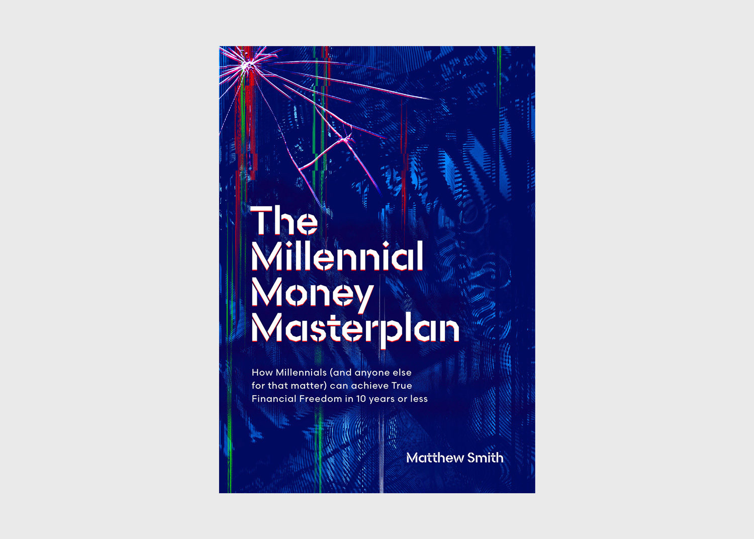
One of Matt’s first pieces of advice for us when we started the project was to avoid a white background and create something that stands out, particularly within the financial section on Amazon. We’re confident we’ve achieved that! What do you think?
We’d recommend giving the book a good read – despite not all being millennials at Upshot. There are useful budgeting tips for everyone included and it’s written with a lovely sense of realism and personality.
Are you an author or publisher looking for a book cover design that catches the eye of your audience? Get in touch to find out if we can help.
–
Written by Owen