April – in a nutshell
30th April 2020
It seems ‘lockdown life’ has now become the norm. We end this month with insight into what we have been up to and what has inspired us, take a look.
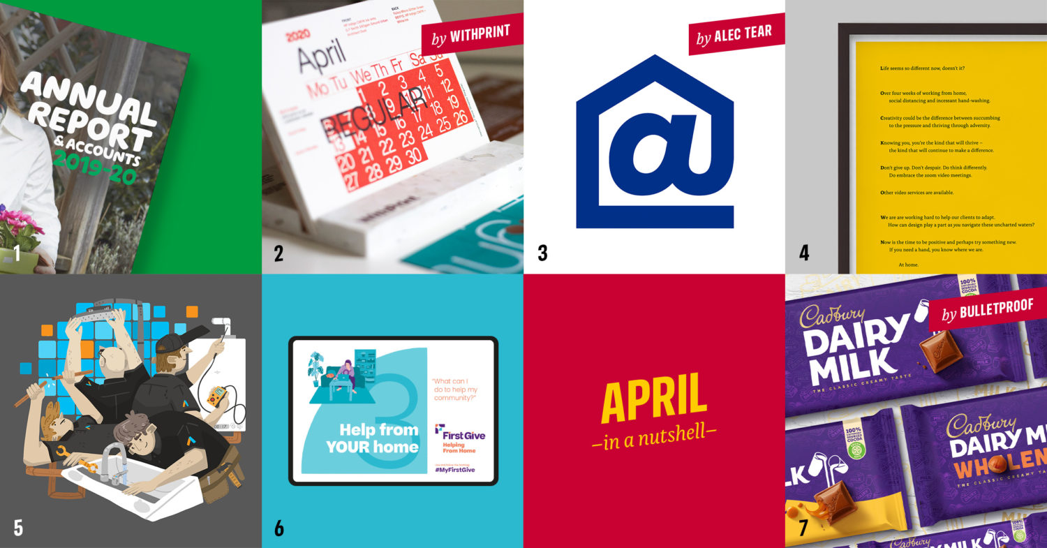
1. Annual report season. This is our fourth year in a row designing the annual report for Macmillan Cancer Support and it gets better each time. It might sound strange, but we love getting stuck into the nuances of how best to display information, reflect brand identity and progress the design from the previous year. We’re also working on the annual report for another charity client, Tearfund, simultaneously and can’t wait to show more.
2. Calendar. Yes, it’s the end of April – a third of the way into the year – but we recently got our hands on the 2020 calendars from our friends at WithPrint, designed by Hugh Miller of Bond and digitally printed using a stunning range of foils and stocks. These guys really are at the top of the game when it comes to digital print and finishing, and we’d urge you to check them out. The calendar is an absolute work of art.
3. At Home logo. This is one of those absolute gifts for a designer, if you’re savvy enough to spot it in time. Alec Tear and Silas Amos designed the mark which went on the front of every paper in the UK this month, encouraging everyone to stay home to protect the NHS. A beautiful ‘smile in the mind’ moment, for sure.
4. Lockdown poem. We were a bit fed up of generic corporate emails (mostly beginning with ‘…in these unsettling/unusual/unprecedented/uncertain times…’) businesses were sending out to explain their position regarding the virus. We thought a more personal and interesting take was required and so we wrote a little acrostic poem. Check it out on our website.
5. Absolute Energy Services. We worked with PCA illustration 3rd year Sean Morgan to create this great illustrated window graphic display for a Plymouth-based plumbing and heating specialist company. Looking forward to seeing it up (when it can, and when we can go out).
6. Helping from home. You might have seen our feed filled with First Give for a while now and that’s because they’re a super-exciting and proactive client of ours. As lockdown was threatened, they jumped straight into producing a ‘from-home’ version of their social action programme for young people and asked us to help create a sub-brand for it, as well as teaching materials and advertising campaign graphics. Keep an eye open for some little animations coming soon! #MyFirstGive
7. Cadbury. London Design Agency Bulletproof created a modern twist to Cadbury and Cadbury Dairy Milk with the first overhaul of its global brand identity in 50 years. By maintaining Cadburys’ iconic history with the vibrant colour purple they have given the brand a modern and playful identify featuring a redrawn wordmark, new iconography and typography. We love the new look.
Be sure to come back in May, bring the sunshine and we’ll supply the news on what another month brings for the Upshot team!