April – in a nutshell
3rd May 2021
Well how about that? Another month snuck up on us and finished without warning! April was a busy one in Upshot HQ with Calum settling in brilliantly, new clients on board, existing projects progressing and loads more. Here’s a little snapshot of what we’ve been inspired by and working on. Let us know what you think.
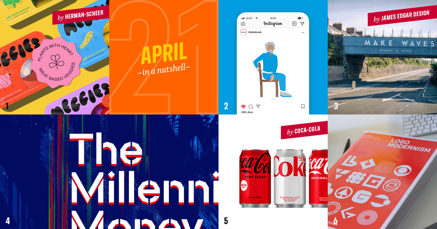
1. Meggies! We love a good April fool’s gag as much as the next design agency, and there’s never any shortage of them but this really tickled us. Aimed at vegans transitioning back to more carnivorous ways, Herman Scheer’s audacious twist on current food trends ‘Meggies‘ featured meat in the shape of vegetables, packaged with brash, colourful packs and humorous illustrations. So unbelievable it was almost believable!
2. Diabetes UK. Getting people moving, particularly in a pandemic-era world, is vital for good health. Charity, Diabetes UK, commissioned us to create a suite of illustrations to showcase simple exercises people can do from the comfort of their own chair, and we look forward to seeing them rolled out soon.
3. Gdynia Way bridge. Good friend of team Upshot, James Edgar Studio, has been working with Building Plymouth and The Road to Mayflower team for several months to create this eye-catching tribute to Plymouth’s links with Polish city Gdynia. We love hearing about the detailed research and process that led to the final design, and think you’ll agree James and the team have done an amazing job.
4. Glitch fun. We’ve been working with financial planner Matthew Smith and Springtime Publishing to create Matthew’s new book, the Millennial Money Masterplan, and found the perfect typeface for the project via Fontstand. Check out this brilliant glitchy stencil font Scandia Line Stencil by Process Type Foundry – ideal for the digital vs physical feel we were after.
5. Coca-Cola. Now this might be a personal opinion of Owen rather than consensus, but this Coke Zero packaging is really frustrating! As someone who likes Coke a lot more than Coke Zero, it’s irritating to see the packaging become even more alike! It’s almost certainly to make it more likely that someone will buy the more profitable Zero project (sugar tax and all that), but it’s so disappointing when you buy the wrong one and at a glance that could be very easily done with this new design.
6. Logo Modernism book. We’ve been busy working on 3–4 new brand identities this month and gathering inspiration and reference has been really key to each one’s development. This monster of a book weighs a tonne and takes up a huge amount of space for a book, but the sheer volume of creative form and concept inside is well worth the extra set of reps needed at the gym in order to lift it!
And there you have it, April in a nutshell. It’s been a good, busy month with lots of exciting things on the agenda.