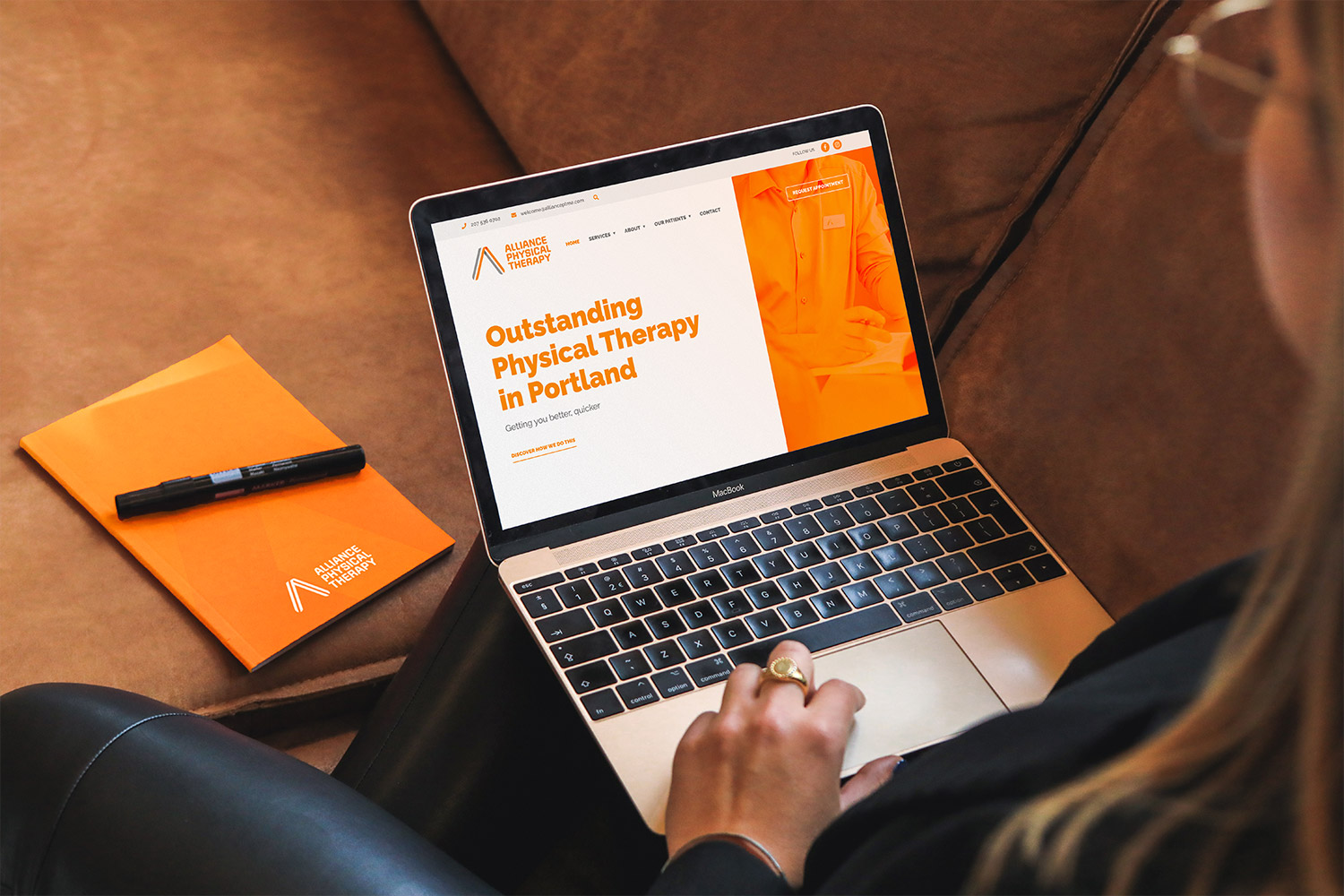
Making Alliance’s website redesign customer-focused
7th October 2021
How has it been five years since we launched the original website for Alliance?
In truth, it doesn’t feel as long to us. We’ve been working regularly with Phil on the usual printed and campaign content. You know the culprits already; brochures, business cards and even the odd court-side banner at a school basketball game!
So as Alliance’s brand guardians, we relish the chance to add value to their usual day-to-day operations. After an email came in to update the footer of the website, we took a good look at the website and mentioned to Phil that there’s a bigger issue on the website when it comes to expressing their brand and business values. Something he whole heartedly agreed with.
Simply put, his website wasn’t talking to the desired audience.
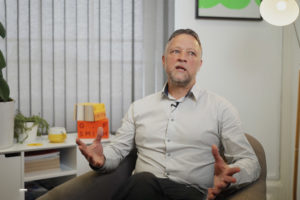
We jumped straight onto Zoom (not for Covid reasons, apparently he didn’t want to pay for a plane ticket for us to visit him in America…) to talk about the website and see how we could better tailor their online platform for potential customers.
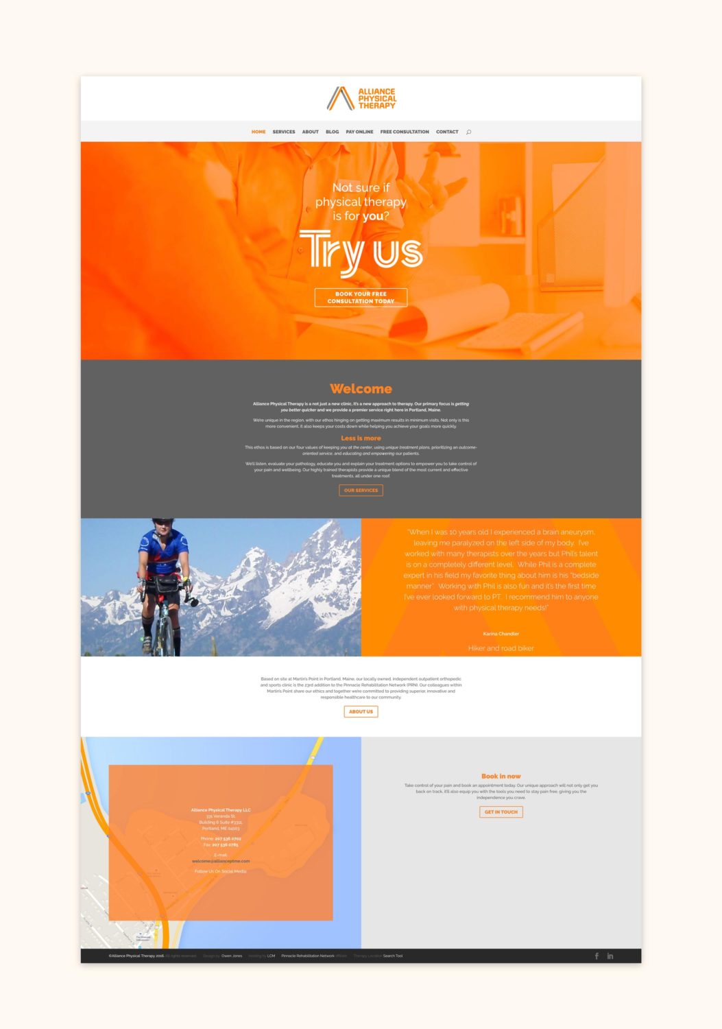
Since launching in 2016, Alliance have gone from strength to strength but it was very clear from our chat that the website was feeling a little tired with out-of-date headers, testimonials and so on. With other competitor websites catching up with standard practices, we needed to better reflect Alliance and their comprehensive service offering today rather than what it was five years ago.
On the road to recovery
The process of tackling an old site is an interesting one, do you scrap the current one and start again or do you build on what’s already there?
Well, after looking into their WordPress setup and theme builder, Divi Themes, we realised that actually the initial build was still pretty solid. It had gone through all the necessary security updates perfectly fine, and Divi is super intuitive – which makes it easy to train the Alliance team on how to use it after we’ve done our job.
We already had some ideas of where audiences may be dropping off and where they find the least engaging content, but we wanted to solidify that with a website audit. We quickly found out that people wanted to get to know who Alliance were, and that people were leaving the site before even finding out about any of the services.
This felt like kind of a big deal to address! We need to introduce Alliances natural, personal tone-of-voice, call-to-action banners and a better explanation of their offering.
Even finding a phone number was enough of a challenge. I’m sure people were overjoyed with the website playing hard to get when really they needed urgent attention to their back pain!
Taking care of business
We’re not physical therapists. In fact, I think designers are quite the opposite. We sit at desks all day, whereas people like Phil from Alliance are always on the move – hopping, skipping and jumping (we assume). What we do know is how to use our time sitting at the desk efficiently, and so the website redesign process begins.
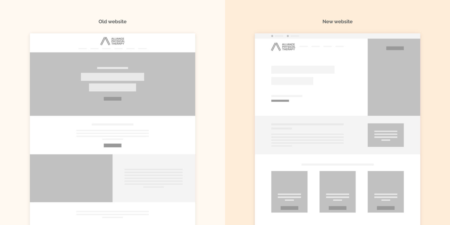
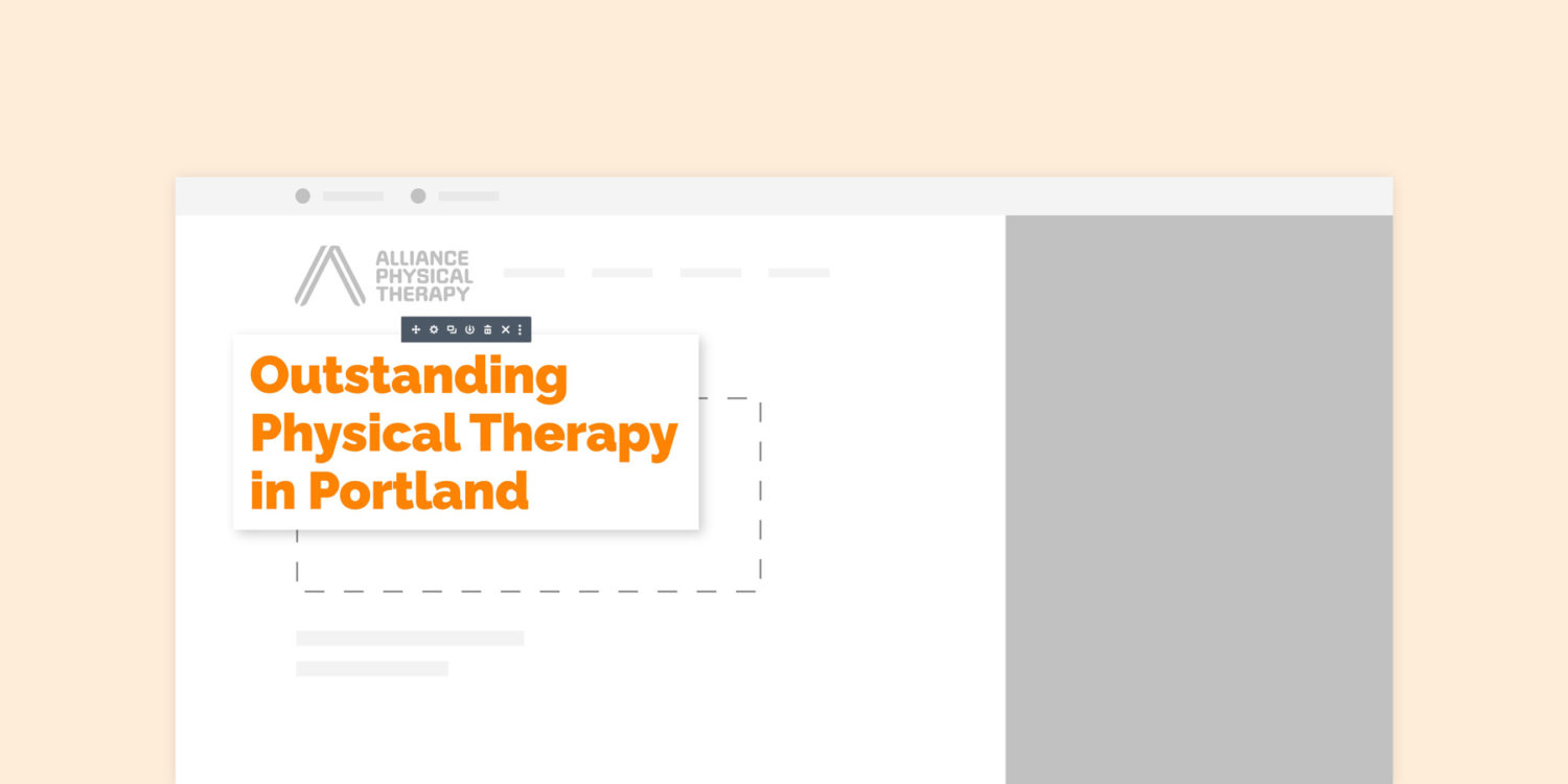
With our list of priorities and website goals agreed, we created wireframes to compare with the old site. The previous design wasn’t giving audiences what they needed; a clear user journey.
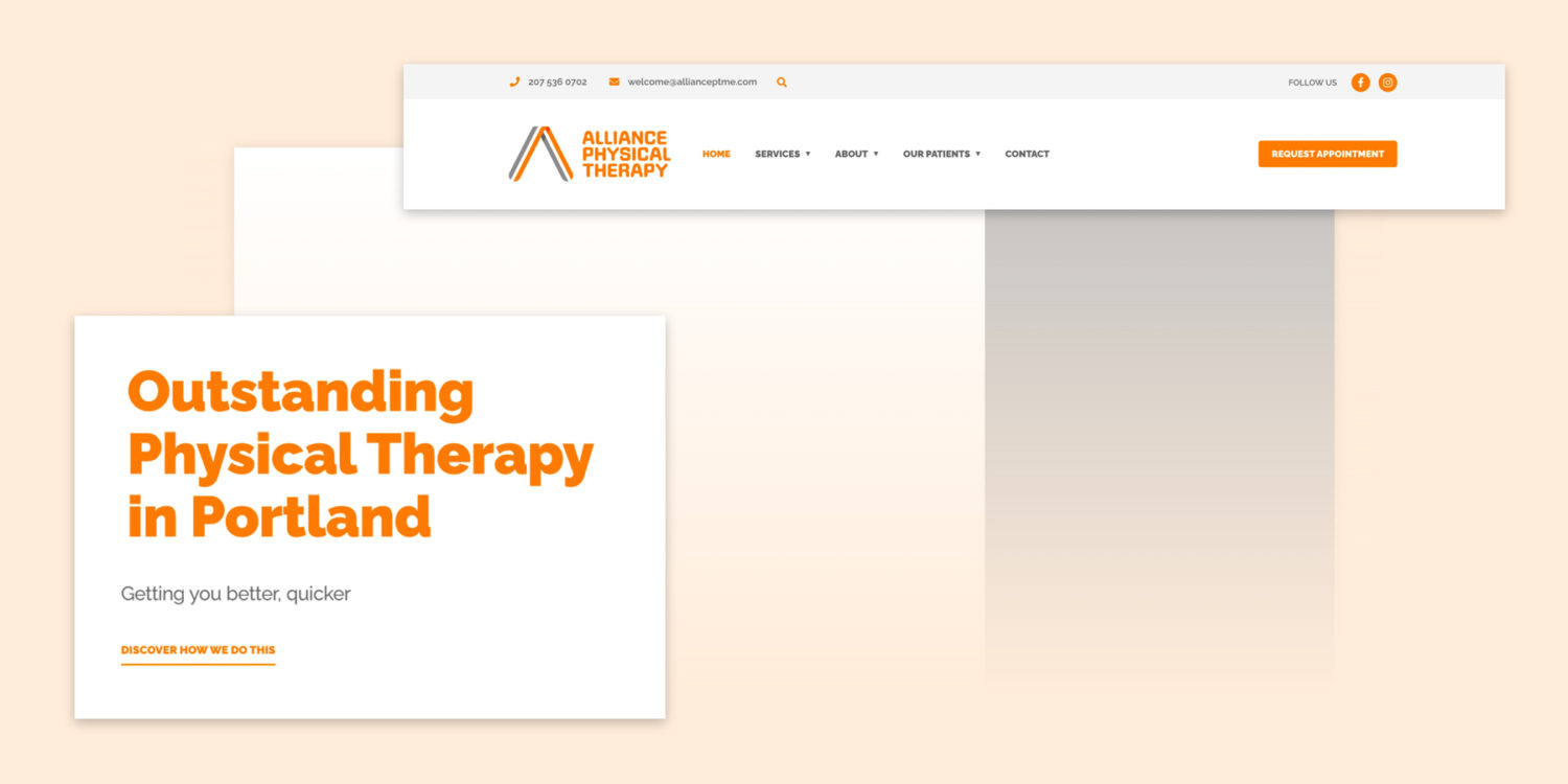
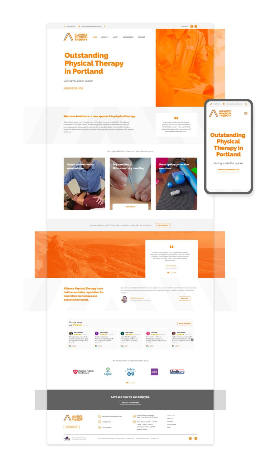
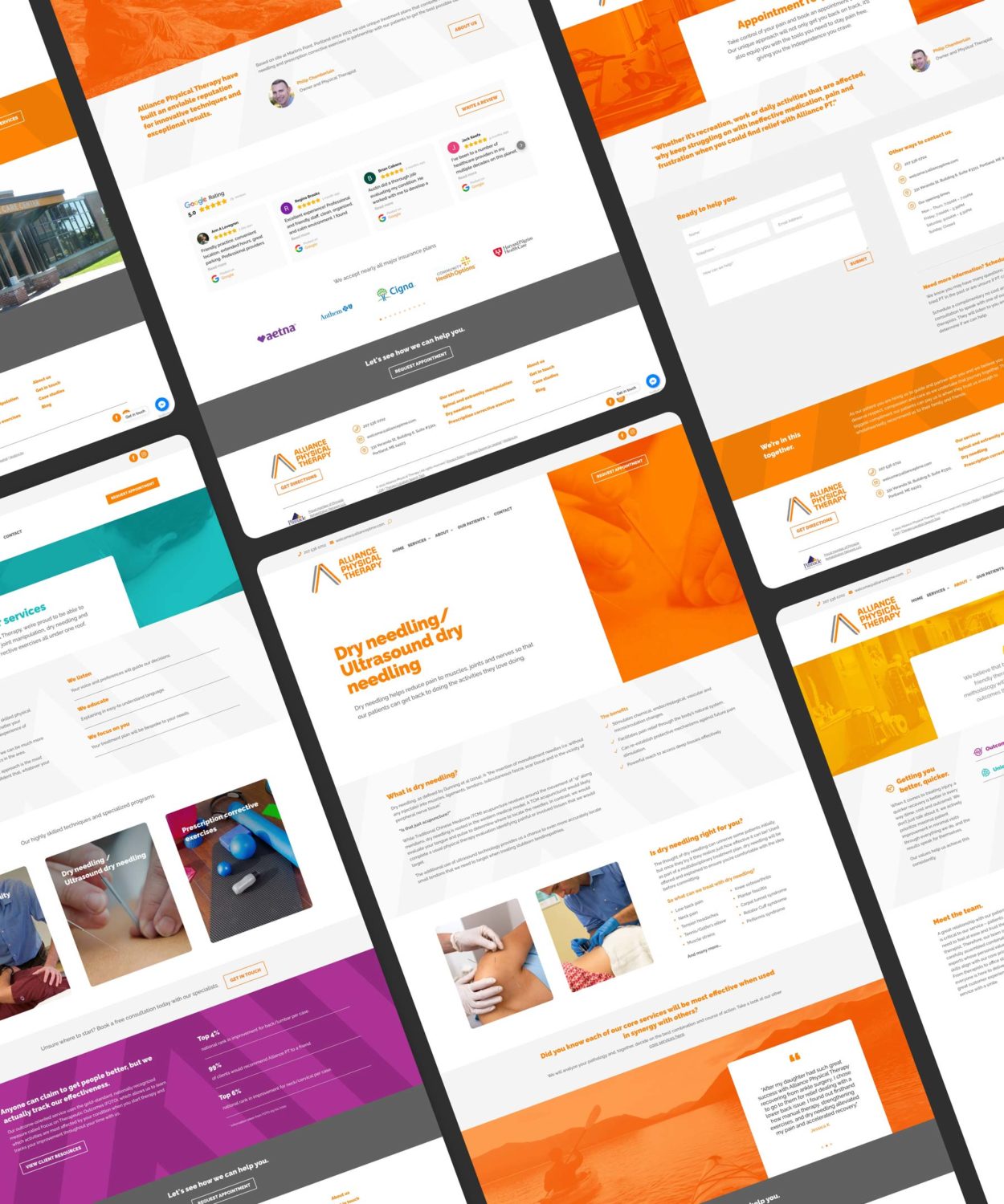
The main navigation changed to focus on what would be important to audiences when they loaded it up on their screens and we re-organised the homepage so that the right content would appear at the right time. So when potential customers are guided through the website with a clear objective, Alliance will end up being able to help more people!
The new structure gave the flexibility that Alliance’s audiences were searching for. Perhaps we’re more alike than we previously thought? (Get it? Flexi… never mind.)
The centre of our website redesign strategy – people
Across the industry it feels like websites for physical therapists have lost focus on the people behind the business. They’re designed in a way that pushes unwanted phone numbers and listing every service without having the physical therapist experts embedded into the business to back it up – this seemed dishonest to us. Alliance prioritise (and get great feedback about) their personal approach and we wanted the website to reflect that.
When we originally went through the branding process, we uncovered exactly what made them different. So now the question really was: how can we best bring these brand pillars to the website and add value to audiences’ experience on the site?

It’s all about people. The people who use the site and need the information quickly and the people behind the business that want to share the science-led services. So the entire website redesign is built around this.
What’s the upshot?
In the end we were able to improve how audiences interacted with the brand. The user interface elements and some of the less accessible colour combinations were softened, and with an improved sense of information hierarchy, the experience was designed to flow at a pace that was refreshing and not overwhelming for the user.
It’s incredibly rewarding to think that we’ve streamlined the process to someone getting better, quicker. We’re excited to monitor the results and continue improving Alliance’s digital presence. Check out the website redesign in action.
If you need any support with a website that’s fallen behind, just get in touch and we can take the necessary steps to put you back on top!
–
Written by Calum